PSYC 2002 Lecture Notes - Lecture 2: Misleading Graph, Pareto Chart, Significant Figures

7 Mar 2017
School
Department
Course
Professor
Document Summary
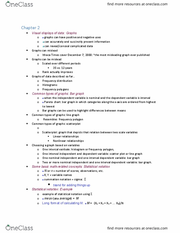
January 11, 2017: graphs can have positive and negative uses, they can accurately and succinctly present information, they can reveal/conceal complicated data. For: continuous variables can take on any value; however, limit to resolution of example, score of 200 includes any value between 199. 5 and 200. 5, depends on rounding conventions interval size. Frequency distribution: graphing conventions: x-axis (horizontal) / categories, y-axis (vertical = values of categories (frequencies) Frequency distribution polygons: for interval and ratio scale data, plot single dot above each score, position of dot on y-axis corresponds to frequency score, draw line connecting dots. )lthaca times cover december 7, (cid:884)(cid:882)(cid:882)(cid:882) (cid:498)the most misleading graph every published(cid:499: scales over different periods (35 vs. 12 years, rank actually improves. Common types of graphs: scatterplot: scatterplot: graph that depicts the relation between two scale variables, observing every data point (linear and nonlinear relationships)