PSYCH 1X03 Lecture Notes - Lecture 1: Descriptive Statistics, Standard Deviation, Frequency Distribution

20 Sep 2016
School
Department
Course
Professor
Document Summary
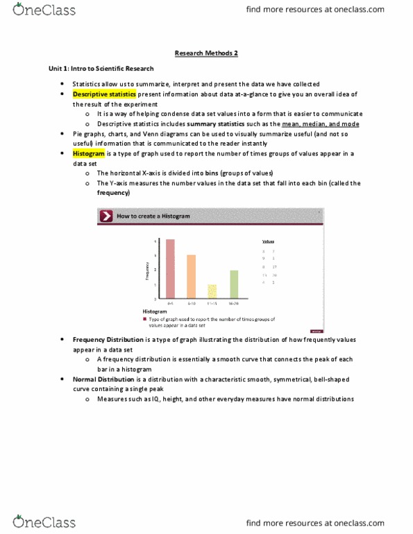
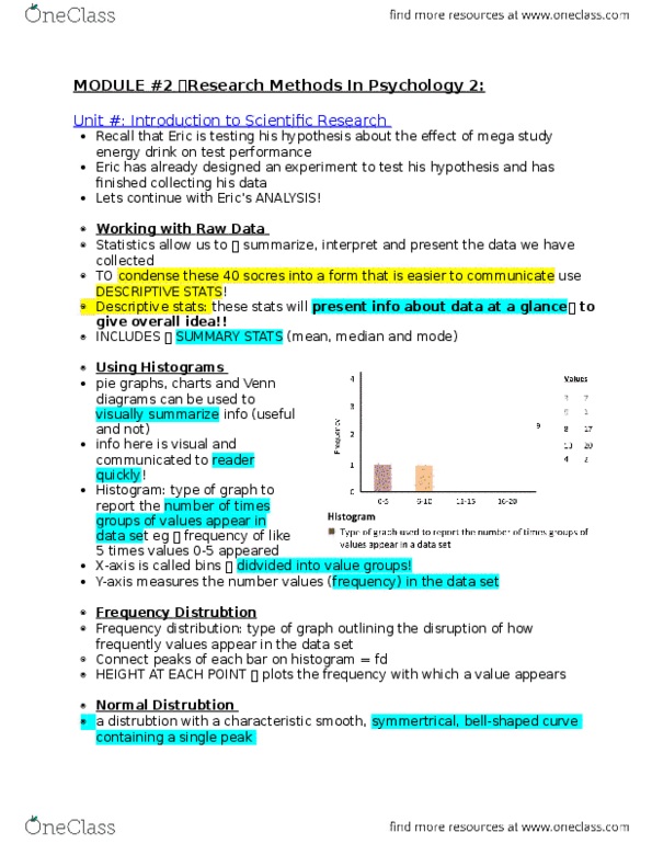
Statistics allow us to summarize, interpret, and present the data that we"ve collected. Condense information from a table into descriptive statistics. Present information at a glance, to give an overall idea of the experiment. Pie charts, bar graphs and venn diagrams can display information visually. Histograms- type of graph used to report the number of times groups of values appear in a data set. Horizontal x axis is divided into bins. Y axis represents the number of values that fall into a given bing along the x axis. Therefore, the tallest bar represents the bin containing the greatest number of data points. Therfore in histograms the highest point represents the most frequent values in that particular group. Use histogram to create a frequency distribution: type of graph that illustrates the distribution of how frequently values appear in the data set. Highest points represent the frequency in which the values appears in the underlying data.