ENVS178 Lecture 3: Charts and Distribution

29 Jan 2019
School
Department
Course
Professor
Document Summary
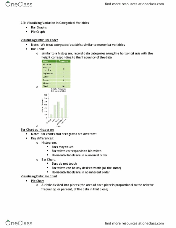
Ranges of the data grouped into bins/intervals. A histogram shows frequency on the y-axis; relative frequency histogram shows percentage on the y-axis. Bin width can alter the graph"s shape. Bars cannot be reordered (have quantitative meaning, there is an order for data) Shows distribution of variables (equal interval/bin width along the x-axis) For small batches, can be done by hand. Quantitative data condition: make sure the data is quantitative before plotting a histogram/stem and leaf display/dot plot. Make sure to display the shape, centre and spread in distribution. Values are distributed symmetrically around the mean. Outliers: values that stand out from a normal distribution. Not a good description of the data when there are outliers. Quartiles: divide the data into 4 equal sections. For skewed distribution or data with outliers. How much territory the middle half of the data covers. One sd from the median covers 68% of the data. Two sd from the median covers 95% of the data.