STAB22H3 Lecture Notes - Lecture 2: Ferrari 360, Frequency Distribution, Lotus Esprit


38
STAB22H3 Full Course Notes
Verified Note
38 documents
Document Summary
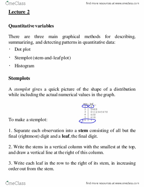
There are three main graphical methods for describing, summarizing, and detecting patterns in quantitative data: A stemplot gives a quick picture of the shape of a distribution while including the actual numerical values in the graph. Example: literacy of men and women: table below shows the percent of men and women at least 15 years old who were literate in 2002 in the major islamic nations: Decimal point is 1 digit(s) to the right of the colon. It places a dot along an axis for each case in the data. It is very like a stemplot but with dots instead of digits for all the leaves. They are quite useful for small data sets. Here is a dotplot of ages for a group of people: A distribution with one major peak is called unimodal. Example: describe the shapes of the distributions summarized by the following stemplots.