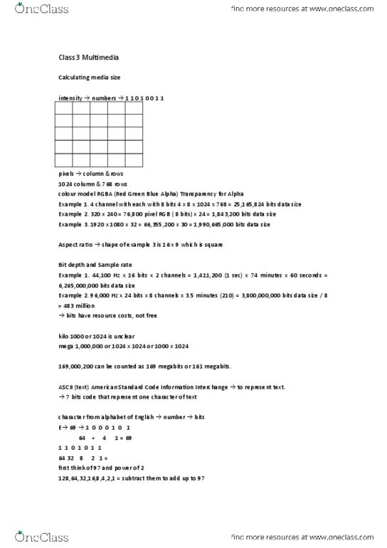
STAT 3010 Lecture 9: stacked bar chart and Contingency Table of Provider by Income

Document Summary
Figure 8. 1: 100% stacked bar chart of switch by provider (n=75) e g a t n e c r e. Table 9. 1: contingency table of provider by income (n=75) 75 r a l l o d e m o c n. Figure 9. 1: boxplot of income by providers (n=75) Table 9. 2: contingency table of provider by income for. Customers who are not likely to switch (n=55) Figure 9. 2 boxplot of income by providers of customers who are not likely to switch providers (n=55) Table 9. 3: contingency table of provider by income for. Figure 9. 3: boxplot of income providers of customers who are likley to switch providers (n=20) s r a l l o. As a whole at&t customers have an average income of ,664. 65 as seen in figure 9. 1. The average income of the at&t customers is the largest compared to the average income for. Cingular customers of ,413. 36 and verizon customers of ,401. 33.