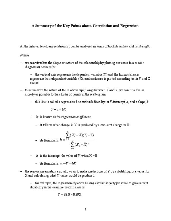
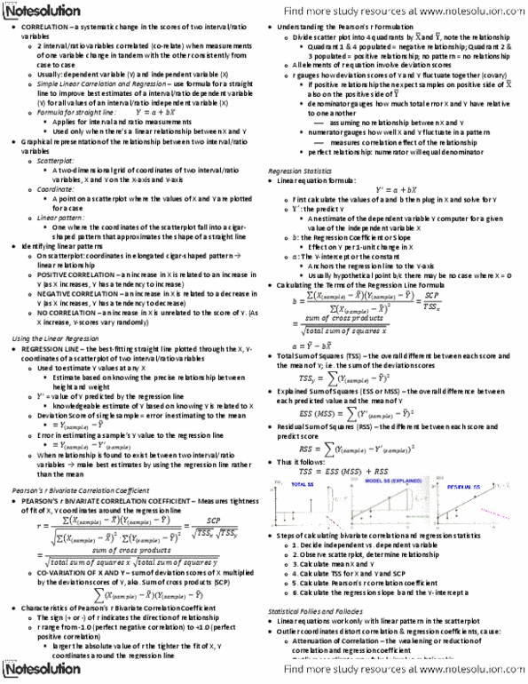
Read the following article on body language during a job interview.
After reading, discuss the following:
- Identify which types of body language could be interpreted as "negative."
- How can poorly written communication change the intent of the author?
- How does our body language communicate positive or negative reactions to others?
Body language during a Job Interview
Written by Frank van Marwijk from Body Communication
Pay attention to time!
It might be a cliche to talk about arriving in time for a job interview, but I think it is still important to bring it to your attention anew. Your attitude or attention to time will also send out non-verbal messages. An interview for a job is seen as a very important appointment, and showing up too late for your appointment is therefore absolutely unacceptable. Missing the bus or getting stuck in a traffic jam are pretty lame excuses. After all, for an important appointment like this you should have taken that into account. It's much better to arrive way too early than even a little too late! If you are too early for your appointment you don't have to go in immediately. Sometimes it's better to walk around a little in the neighborhood, because waiting for a long time in a hallway or a ‘sweat-box' will not do your nerves any good. If it is very cold outside, it might be wise to go back inside about ten minutes before your appointment because it can be very unpleasant to have to shake an ice-cold hand.
The first meeting
After you have announced yourself at the reception or to an employee of the company, you will often be asked to take a seat. After a while someone will come to lead you to the interview area. Do not jump up immediately and offer this person a handshake. It's better to let the other person takes the initiative. Shake hands firmly, but not too powerfully and look straight at the other person. After this you will be introduced to the (other) members of the application committee. During this introduction it is better to walk around the table to shake hands with the committee members, instead of leaning over the table. With each greeting look directly at the other person, and say your name. Except for an internal application, don't assume that the other people know your name.
Choosing the right seat
After the initial introduction you will usually be directed to take a seat. If you are left to choose a place yourself, choose a place from where you can clearly see all the interview participants, and from where they can also see you. If someone is sitting half behind you, and you can't really see him, he may not get such a good impression of you because of this.
Tune your body posture
During your job interview try to adopt a posture that shows interest but still comes across as being relaxed. You can do this by sitting up straight in your chair at the beginning of the interview, with your back against the back of the chair. If you slouch or hang sideways in your chair, it might give the impression that you are not that interested in the job. However, sitting on the edge of your chair can come across as being a little tense and might give the impression that you feel uncomfortable.
You can change your body posture a little during the interview. For example, when someone says something it is good to turn a little with your shoulders towards this person and to lean forward a little. This shows an interest in what the other person is saying. You can emphasise this by tilting your head a little. It is also important to pay attention to the posture of your interview partners. In some cases you can achieve mutual tuning by adopting the same posture as the other person.
What to do with your hands?
Just the same as when you are giving a presentation, many people often regard their hands as obstacles during a job interview rather than a useful means of communication. That is why people often ask what to do with their hands. In a difficult situation we are often inclined to fold our arms across our body. This helps to give us a more secure feeling. During a job interview it is better not to do this, because folding your arms can be interpreted as a defensive move. It is better to let your hands lie loosely on your lap or place them on the armrests of your chair. From these positions it's also easy to support your words with hand gestures.
Movements: a dynamic interview?
Nodding your head while speaking is a good way of supporting your words or adding meaning to them. Hand movements can also help to liven up the interview. The fact that you dare to make movements with your hands during an interview might indicate that you feel at ease quickly. In most cases it is better not to make too many hand movements at the start of the interview but add them slowly throughout the interview. As regards this, pay attention to your interview partners as well: if they use their hands a lot to make things clear, you can definitely do this as well. When they don't make many movements, it is better if you don't either. Just the same as with body posture, it is important to tune your movements to those of the other person. Also pay attention to inadvertent movements that you may make sometimes due to nervousness. For example, shuffling with your feet or kicking against the leg of a table can be very irritating for other people. Drumming with your fingers or clicking with a pen also won't be a great contribution to the interview. So pay attention!
When should you look at whom?
During the job interview it is important to look at all the interview partners to an equal extent. By looking directly at the other person we are giving them a sign of trust. By looking directly at people we are also in control of the conversation. Looking directly at somebody or looking away actually serves as the dots and commas in our spoken sentences. When one of the committee members explains something or poses a question, keep looking at this person for as long as he or she is speaking. This shows that you're listening. While he is speaking he may also look at the other people, but every time he wants to emphasize something he will look at you again. You can then nod to encourage him to continue talking. At the end of his question, he will keep looking at you and then tilt his head up a little to invite you to give an answer. When you answer a question, you will look first at the person who posed the question, but while you answer you should take turns looking at the other interview partners as well. You should direct yourself again to the person who posed the question when you want to emphasize something and at the end of your answer.
Also pay attention to the body language of your interview partners
Apart from paying attention to your own body language, it is also important to see how your interview partners are behaving. The postures and movements of other people can give you an impression of how you are coming across to them. This can serve as a warning at an early stage that you might be doing something wrong that you are not being aware of. For example, when the committee members are of the opinion that you hold the floor for too long or you annoy them with your interruptions, they will show their irritation at first through their body language. When the committee members shake their heads, sigh or fold their arms and lean back, you can take this as a sign of displeasure. Usually it is not yet too late to change this. You see, it also applies to your interview partners that their body language takes place subconsciously. However, don't wait too long because then their irritation will transfer to their consciousness.
Do not worry too much about tension
Knowledge of body language can help you improve the mutual tuning during the interview. You can use this knowledge to hide your nervousness a little, but actually this is something you shouldn't worry about too much. Many applicants are nervous during an interview and of course they would much prefer not to let this nervousness show. However, it's not such a bad thing to be nervous. The committee members will understand this. Your nervousness may even show that you feel this job is important to you. If you weren't nervous, and therefore sit a little nonchalant, it might indicate that you are not that interested. Also realize that the job interview is more than just a means for the employer to determine which of the candidates is most suitable for the job. The job interview especially is a moment of mutual acquaintance. It's a first meeting with people that you might soon work together with. Therefore the boss should actually be just as nervous as you!