BANA 2082 Study Guide - Quiz Guide: Bubble Chart, Pie Chart, Heat Map
8 Nov 2020
School
Department
Course
Professor
Document Summary
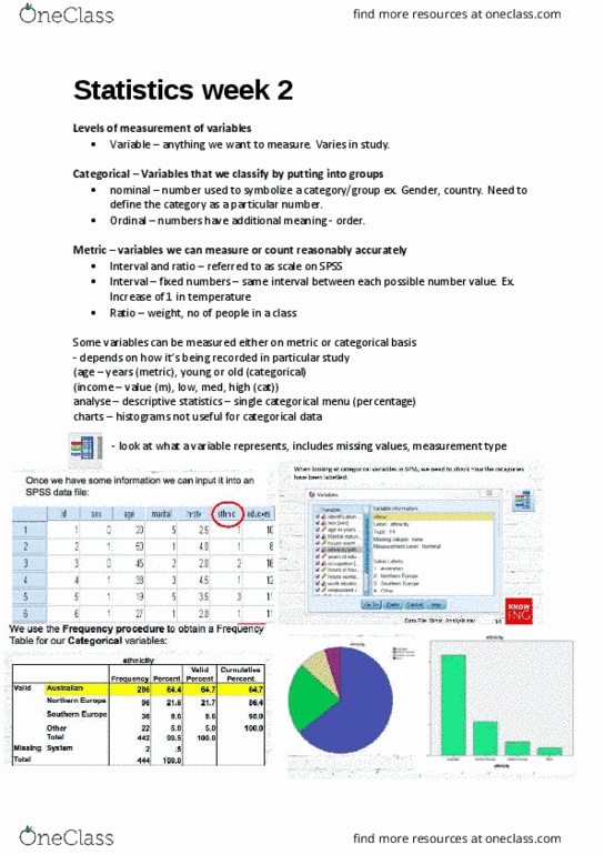
A _____ is a graphical presentation of the relationship between two quantitative variables. Answer: scatter chart: _____ are visual methods of displaying data. Answer: charts: a _____ is a line that provides an approximation of the relationship between the variables. Answer: trendline: the attached image is a _____. Answer: line chart: a line chart that has no axes but is used to provide information on overall trends for time series data is called a _____. Answer: sparkline: the charts that are helpful in making comparisons between categorical variables are. Answer: bar charts and column charts: making visual comparisons between categorical variables may be difficult in a _____. Answer: pie chart: in order to visualize three variables in a two-dimensional graph, we use a _____. Answer: bubble chart: a two-dimensional graph representing the data using different shades of color to indicate magnitude is called a _____.