STAT 101 Lecture 4: STAT 101- Chapter 4

23 Nov 2017
School
Department
Course
Professor
Document Summary
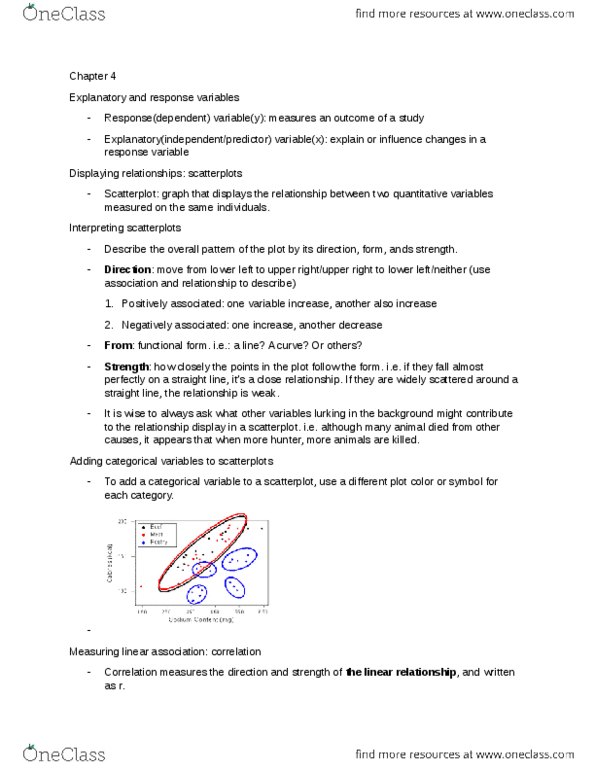
A response variable measures an outcome of a study. An explanatory variable may explain or influence changes in a response variable. Scatterplot: the most useful graph for displaying the relationship between two quantitative variables is a scatterplot, a scatterplot shows the relationship between two quantitative variables measured on the same individuals. The values of one variable appear on the horizontal axis, and the values of the other variable appear on the vertical axis. As a reminder, we usually call the explanatory variable x and the response variable y. If there is no explanatory-response distinction, either variable can go on the horizontal axis. Interpreting scatterplots: to interpret a scatterplot, follow the basic strategy of data analysis from chapters 1 and, look for patterns and important departures from those patterns. A scatterplot displays the strength, direction, and form of the relationship between two quantitative variables. The correlation, r, measures the strength of the linear relationship between two quantitative variables. r.