SCMA*1000 Lecture Notes - Lecture 2: Data Visualization, Scatter Plot, Bar Chart

Document Summary
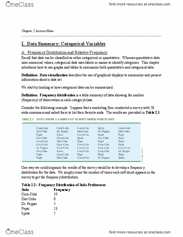
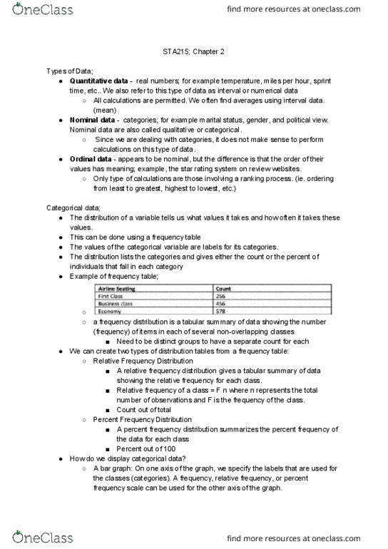
Frequency distribution is a tabular summary of data showing the number (frequency) of observations in each of several non-overlapping categories or classes. The objective is to provide insights about the data that cannot be quickly obtained by looking only at the original data. The relative frequency of a class is the fraction or proportion of the total number of data items belonging to the class. A relative frequency distribution is a tabular summary of a set of data showing the relative frequency for each class. The percent of a class is the relative frequency multiplied by 100. A percent frequency distribution is a tabular summary of a set of data showing the percent frequency for each class. A bar chart is a graphical display for depicting qualitative data. On one axis (usually the horizontal axis), we specify the labels that are used for each of the classes.