STAB22H3 Lecture Notes - 2G, Scatter Plot, Probability Plot


38
STAB22H3 Full Course Notes
Verified Note
38 documents
Document Summary
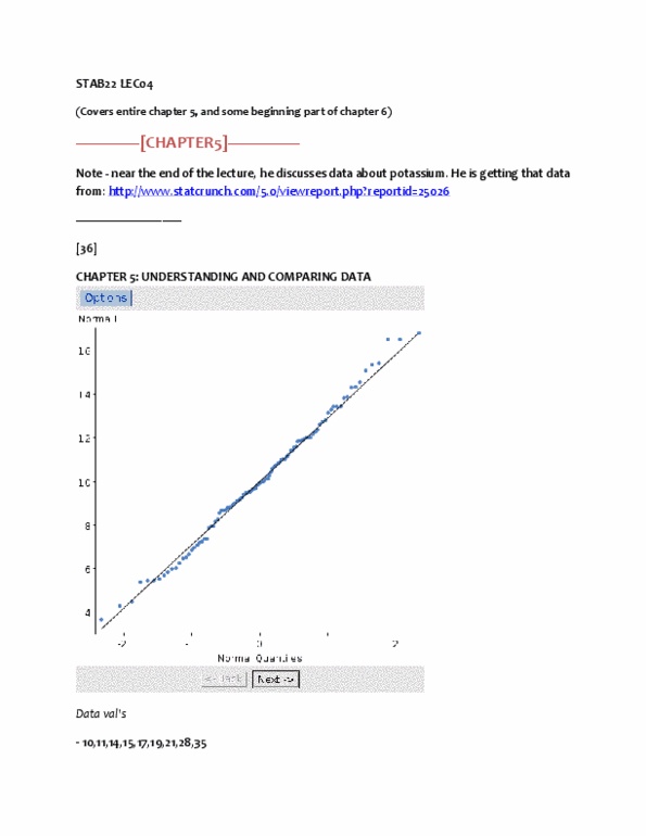
Stab22 lec06 (covers the remaining part of chapter 6 and start of chapter 7) Can easily tell by making & looking at npp (normal probability plot) This is indicated by bunch of high val"s spread out, and then have bunch of low val"s (ex) potassium data for breakfast cereals. For normal distribution, the pts have to be pretty close to, or on the black line. Realistic data typically does not follow blk line precisely. It looks ok to form a normal curve for this because val"s are pretty close to blk line. Notice that it curves down, and then curves up. This one is symmetrical, but too many outliers for it to be normal. Although it wiggles (meaning it curves), overall the pts are not far away from line. It had hole in the middle, sth that npp could not tell you outliers. Within +/- 1 sd away from mean, there is about 68% of the data.