Statistical Sciences 2035 Lecture Notes - Lecture 2: Pareto Chart, Vilfredo Pareto, Contingency Table

6 Oct 2017
School
Department
Professor
Document Summary
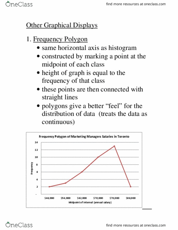
2. constructed by marking a point at the midpoint of each class. 3. height of graph is equal to the frequency of that class/cell (or relative frequency) 4. these points are then connected with straight lines. 5. polygons give a better feel for the distribution of data (treats the data as continuous) Toronto y c n e u q e r. Ogive (cumulative relative frequency polygon: the graph starts at the lower boundary point of the first interval with a 0. ,000 y c n e u q e r. 000 or more: 55% of them earn 000 or more, 45% of then earn less than 000. The following are the price per share (nearest $) of 30 companies listed in the. Using a cell width of , set up a frequency table, graph the data using a histogram, frequency polygon and an ogive, and make some observations about the distribution of the data.