Statistical Sciences 2035 Lecture Notes - Lecture 2: Cumulative Frequency Analysis, Ogive, Pareto Chart

28 Oct 2017
School
Department
Professor
Document Summary
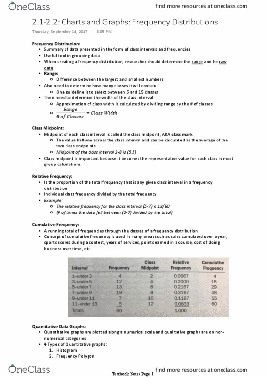
Frequency polygon of marketing managers salaries in toronto y c n e u q e r. Ogive (cumulative relative frequency polygon: the graph starts at the lower boundary point of the first interval with a 0. Ogive for marketing manager salaries in toronto y c n e u q e r. You can use the ogive to determine the relative position of salaries: for example, about 30% of all marketing managers salaries are ,000 or less. The following are the price per share (nearest $) of 30 companies listed in the. Using a cell width of , set up a frequency table, graph the data using a histogram, frequency polygon and an ogive, and make some observations about the distribution of the data. Share prices of dow jones companies y c n e u q e r. Frequency polygon of share prices y c n e u q e r.