MAT-1010 Lecture Notes - Lecture 2: Pie Chart, Bar Chart, Protractor

9 Feb 2017
School
Department
Course
Professor
Document Summary
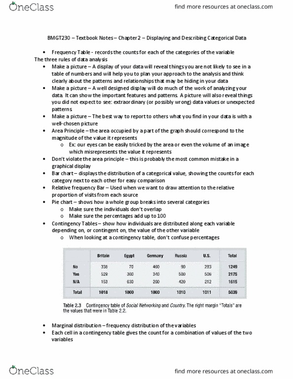
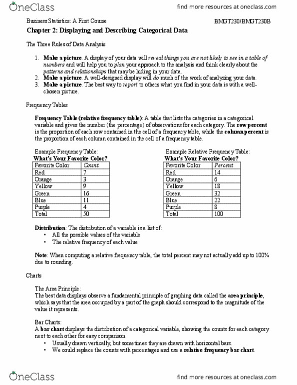
The three rules of data analysis: make a picture- things may be revealed that are not obvious in the raw data. *these will be things to think about: make a picture- important features of and patterns in the data will show up. *you may also see things that you did not expect: make a picture- the best way to tell others about your data is with a well-chosen picture. Displays the distribution of a categorical variable. Bar chart stays true to the area principle. Good graph title labeled x and y axis. A relative frequency bar chart: displays the relative proportion of counts for each category. The area principle the area occupied by a part of the graph should correspond to the magnitude of the value it represents. Shows the whole group of cases as a circle they slice the chart into pieces whose size is proportional to the fraction of the whole in each category.