OPER1135 Lecture Notes - Lecture 1: Normal Distribution, Interquartile Range, Box Plot

10 Aug 2016
School
Department
Course
Professor
Document Summary
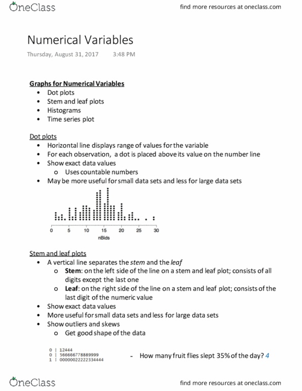
Info about how data was collected; as much info as possible. Statements need i be backed up by stats, data. Possibly use headings; make sure the headline summarizes the main point well. Allow you see the distribution of values in a numerical data set. Frequency = y-axis = how many times you see it (i. e. how many people scored an 85 on a test) Intervals always have to be the same size. Bins can"t overlap or have gaps (can"t have 0-15, 10-25, etc. and can"t have 0-8, 12-20) Scatter plots the thing you are trying to predict goes on the y-axis. Relative frequency percentage of frequency (i. e. 10 people got as in an 100 person class; relative frequency is 10%). Use this for the y-axis when the populations are not the same. Gave data in a variety of ways: charts, tables, interpretation. At least p% of observations fall in k standard deviations from the mean.