STAT-3090 Lecture Notes - Lecture 3: Pie Chart, Bar Chart, Frequency Distribution

2 Oct 2017
School
Department
Course
Professor
Document Summary
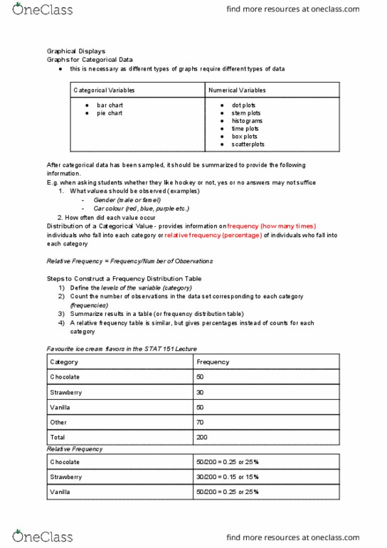
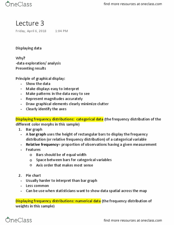
From information about baseball to information about income, the most basic task when working with data is to summarize a great deal of information. Graphical images are universally regarded as a powerful method of communicating data. A frequency distribution summarizes data by category (class) and the number of observations of each category. A relative frequency distribution summarizes data by category and the relative frequency or the proportion of observations in each category. You should be able to create frequency distributions with and without the use of technology. Complete the table below to create a frequency and relative frequency distribution. Relative frequency distribution: gives the proportion of wins. Qualitative data bar charts and pie charts. Pareto chart - the categories are ordered by their frequency or relative frequency. A pie chart provides the relative frequencies of each category represented by the proportion of a circle that corresponds to the relative frequency.