MATH 10041 Lecture Notes - Lecture 3: Histogram

15 Sep 2018
School
Department
Course
Professor
Document Summary
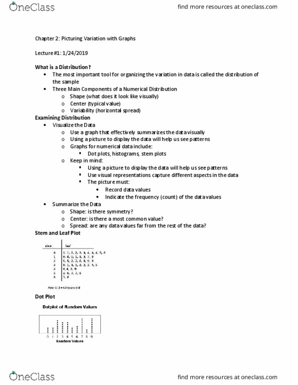
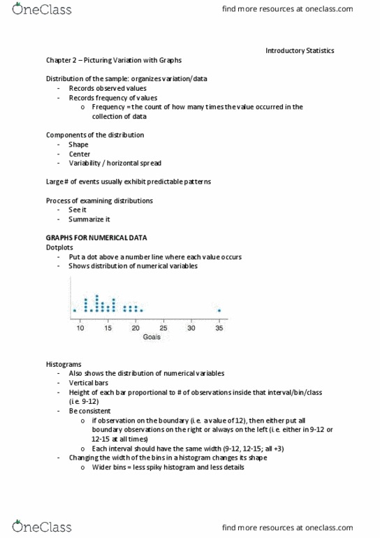
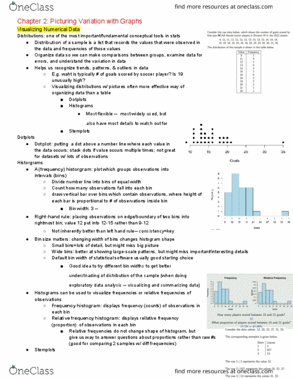
Distribution of a sample- a way of organizing data. Frequency- count of how many times each value occurs in the data collected. Dot plots- place a dot where each value occurs. The total of all relative frequencies in an observation adds up to 1. Relative frequency histogram- graphs what proportion of an observation shows. Ex. what proportion of players scored 9 goals. Percentage frequency- relative frequency (out of 100) Percentage chart- graphs highest frequency to lowest frequency. Pay attention to shape, center, and spread to describe a graph. If the numerical values tend to be close in range, the plot will be skinny and have less variety. If the numerical values tend to be wide in rage, the plot will be fat and have more variety. Bar graphs- shows a bar for each observed category. Histogram information is placed specifically, bar charts have no order. Bar charts width have no meaning, histograms do.