EEMB 146 Lecture Notes - Lecture 3: Bar Chart, Pie Chart, Frequency Distribution

12 Apr 2018
School
Department
Course
Professor
Document Summary
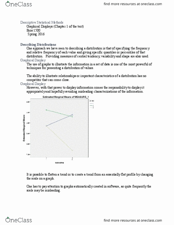
Make patterns in the data easy to see. Displaying frequency distributions: categorical data (the frequency distribution of the different color morphs in this sample) A bar graph uses the height of rectangular bars to display the frequency distribution (or relative frequency distribution) of a categorical variable. Relative frequency= proportion of observations having a given measurement. Can be use when statisticians want to show data spatial across the map. Displaying frequency distributions: numerical data (the frequency distribution of weights in this sample) weights in this sample) Width of the bar can vary based on the interval. Different from bar graph in that histogram has a numerical x-axis. The cumulative relative frequency at a given measurement is the fraction of observations less than or equal to that measurement. Associations between categorical variables (the effect of the individual"s sex on virus infection status) Comparing numerical variables between groups (the distribution of fungal loads for each color morph)