STAT 150 Study Guide - Quiz Guide: Howard Wainer

27 Sep 2016
School
Department
Course
Professor
Document Summary
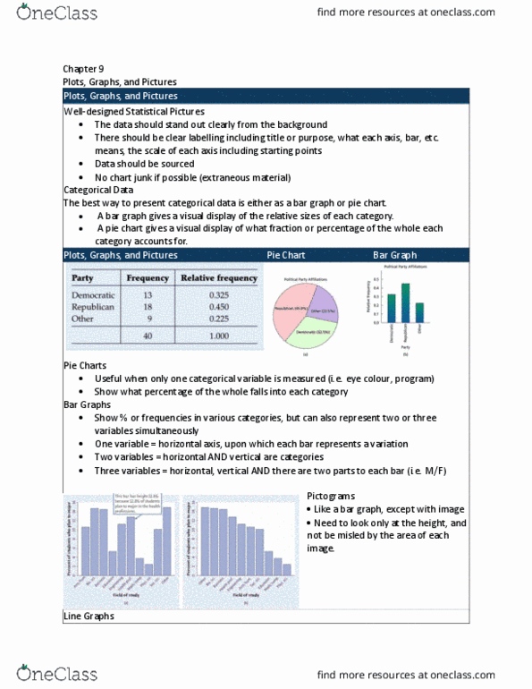
How to display data bady by howard wainer. Almost a satire on the unprofessional nature of how some data is presented. The first set of bad data display depicts 3 graphs with no labels on the y-axis. People have to be sure to label their axis so that there can be a sort of scale to base the data on. The second graph doesn"t seem to have any visual other than the axis. Says rule 1- show as few data as possible . In reality you want to show a concise depiction of a large amount of data. The labor productivity graph is essentially a piece of propaganda, making the us seem positive as it was produced by the washington post. It is paramount to be as unbiased as possible when depicting data, so readers can get the actual idea of the data.