QMS 102 Chapter Notes - Chapter 3: Scatter Plot, Contingency Table, General Idea

24 Feb 2014
School
Department
Course
Professor
Document Summary
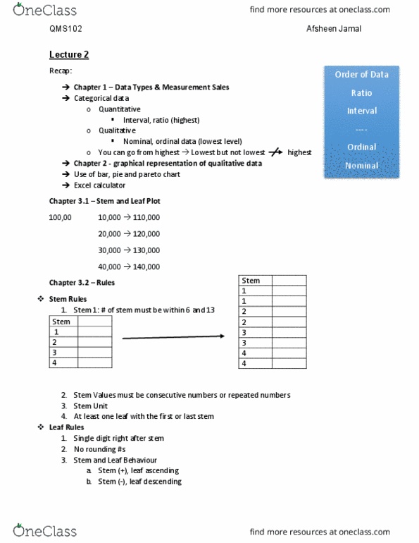
3. 1 how do you organize quantitative data graphically: present ration and interval data using histograms, polygons, ogives, stem-and- leaf plots, frequency distribution, contingency table and scatter plot. 3. 2 stem-and-leaf plot: looks like a horizontal bar chart maintaining most of the original data values, ex: value of 84 can be represented into 8 (stem value) and 4 (leaf value, example of a stem-and-leaf plot: Leaf (10,000: you must have a title for a stem-and-leaf plot. The bracket values tell us how much each stem or leaf is worth (stems: 100,000; 200,000; 300,000; etc. : entry one is 1 and its value is 100,000 so we do 1*100,000 because going up by. 100,000s is too big, breaks rules: stem: 1*100,000; leaf: 1*10,000; add them up = 110,000 for first value, & so on. If stem is repeated twice: values 0-4 go on first stem and 5-9 on second stem. 0-1 on stem 1, 2-3 on stem 2, 3-4 on stem 3, etc.