MGMT 1050 Chapter Notes - Chapter 3: Scatter Plot, Line Chart, Histogram

13 Nov 2013
School
Department
Course
Professor
Document Summary
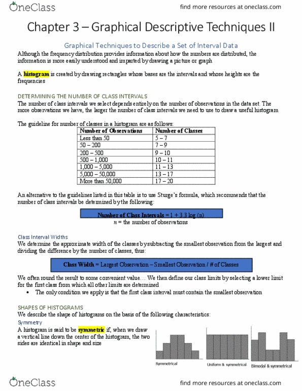
Graphical techniques to describe a set of interval data. Histogram: rectangles whose bases are the intervals and heights are the frequencies. Negatively skewed = tail on the left. Modal class class with the largest number of observations. Advantage of stem-and-leaf is that we can see the actual recorded value of observation. Ogive: graphical representation of the cumulative relative frequencies. 38. 23 = stem is 3 and leaf is 8) Cross-sectional data: observations are measured at the same time. Time-series data: data measurements at successive points in time. Line chart a plot of the variable over time (graphs time-series data) Uses scatter diagram to illustrate the relationship. The 2 most important characteristics of scatter plots are the strength and direction of the linear relationship. Factors that identify when to use a scatter diagram: objective: describe the relationship between 2 variables, data type: interval. Graphical excellence: techniques that are informative and concise and that impart information clearly to their viewers.