MATH 140 Lecture Notes - Lecture 1: Standard Deviation, Supreme Headquarters Allied Powers Europe, Bar Chart

Document Summary
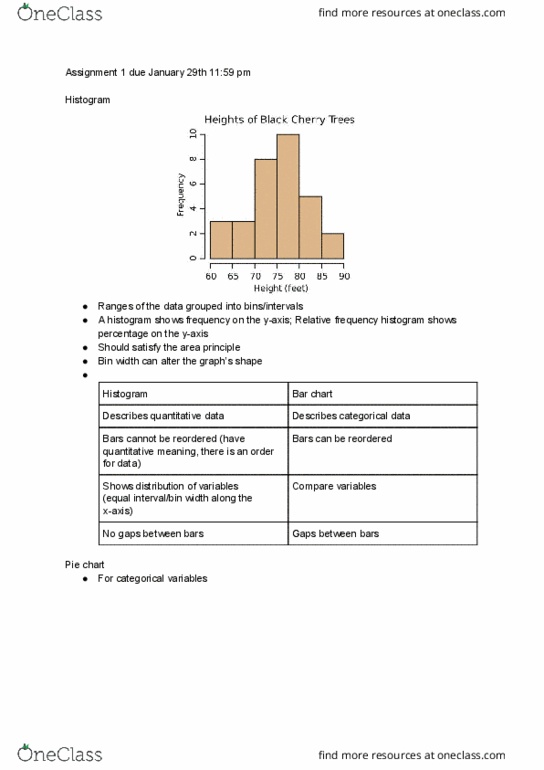
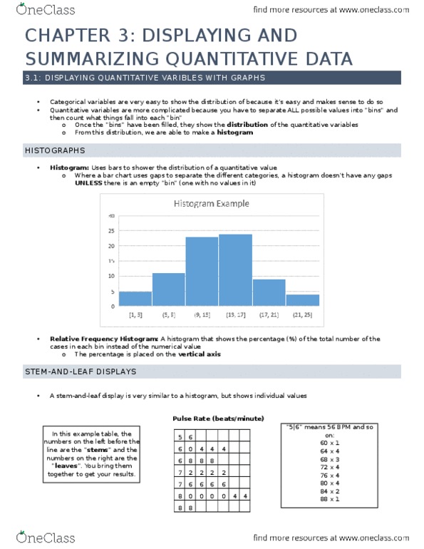
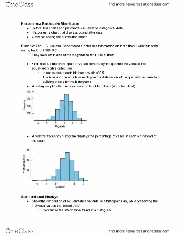
In order to make a pie chart we must know the portion/ percentage. In order to make a bar chart, we do not need the total and the bars do. Quantitative data is a portion of a bar in a bar graph aka bucket/ bin. If it is asking for the percentage you would use the data. Make the bucket/ bin by estimating the percentages. With the quantitative data you can make a histogram. Bucket/bin { 55-59}; {60-64}; {65-69}; {70-74}; {75-79}; {80-84}; {85-89} Example: a histogram would have bars, like a bar graph but the bars actually touch and they are the same color. It has an approximately has a smooth curve. In this case, we see that it have a smooth curve and there are different cases where it could look differently, but can still be considered as smooth. Discussing the properties of a distribution, we will see why and what it is.