BUSS1020 Lecture Notes - Lecture 2: Ogive, Time Series, Central Tendency

13 Sep 2018
School
Department
Course
Professor
Document Summary
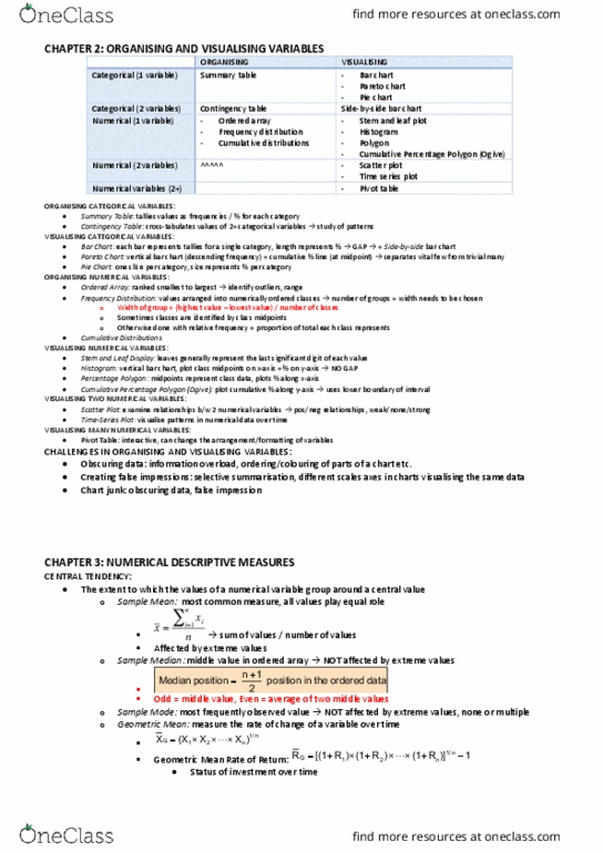
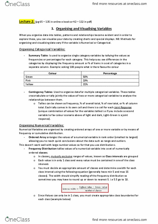
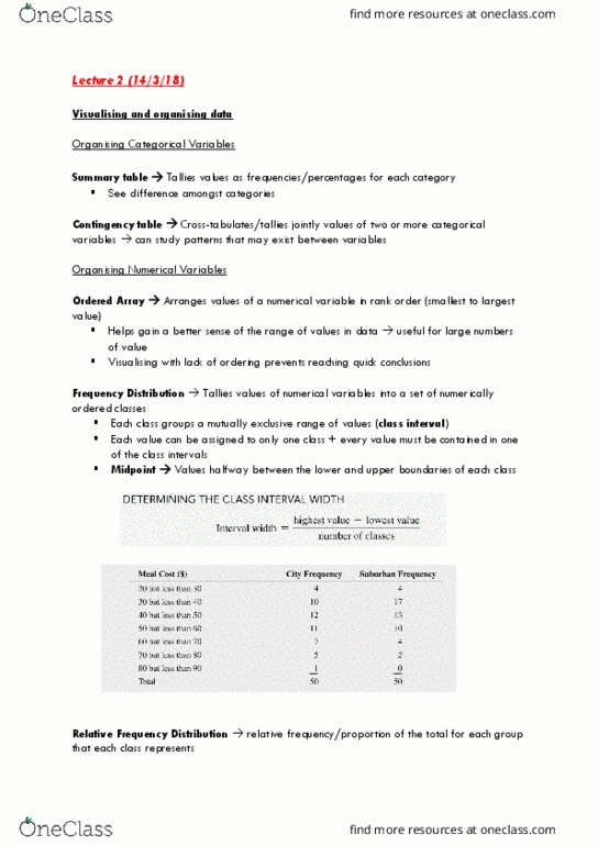
Ordered array: a sequence of data in rank order from smallest largest value, pros: shows range and helps identify outliers. Frequency distributions: a summary table where data is arranged into numerically ordered classes, steps for frequency distributions, 1. Define class interval (width)- round up boundaries so no data missed: 5. Cumulative distributions: all frequencies from previous classes added up (cumulative observation value of each class, ^the last figure in the cumulative freq column should equal the total freq. Visualising categorical data: (comes after table of data numerical summarised) Bar chart: for nominal data, can be veritical/horizontal, the length of each bar could rep the amount/freq/percentage of values in each category, (note most likely not in quiz 1) Pie chart: for nominal data, circle broken in slices representing categories; each slice reps percentage. Side-by-side bar charts: for ordinal data, note: sometimes better to represent percentage freq rather than normal freq- better representation of data gaps: