STAT 100 Lecture Notes - Lecture 6: Quartile, Pie Chart, Bar Chart

Document Summary
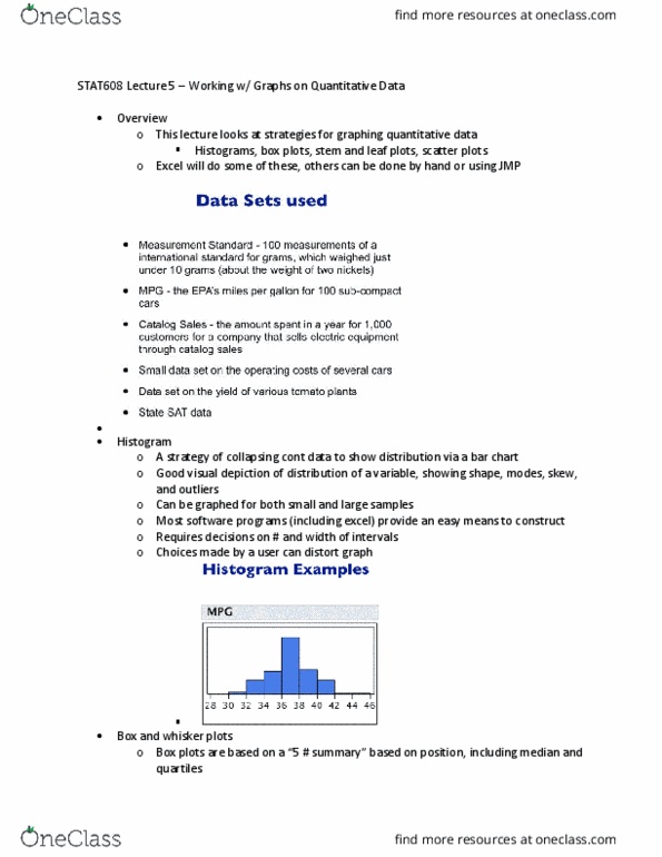
Pictogram which is a bar graph that uses images in place of bars. Therefore, anything using mean or min or max is also affected, such as variance and standard deviation (instead of using mean) and range. Therefore, measures of spread such as quartiles and irq are less affected. Ex: misleading unites because of failure to adjust for inflation. Which of the following would be best to display information about the ages of students enrolled at penn states world campus. The above boxplot gives the distribution of the percent of times a batter got on base for 108 batters in the american league during the 1999 baseball season. The five numbers in a five-number summary are the. Lowest value, lower quartile, median, upper quartile, and the highest value. There do not appear to be any outliers. Is not consistent with the bulk of the data.