STATS 10 Lecture Notes - Lecture 5: Scatter Plot, Lincoln Near-Earth Asteroid Research, Dependent And Independent Variables

Chapter 4: Regression Analysis: Exploring Associations Between Variables
● Plots to visualize numerical data: dotplots, histograms, stemplots
● When describing numerical distribution, consider: shape, center, spread
● We will consider questions about the relationship between two numerical variables
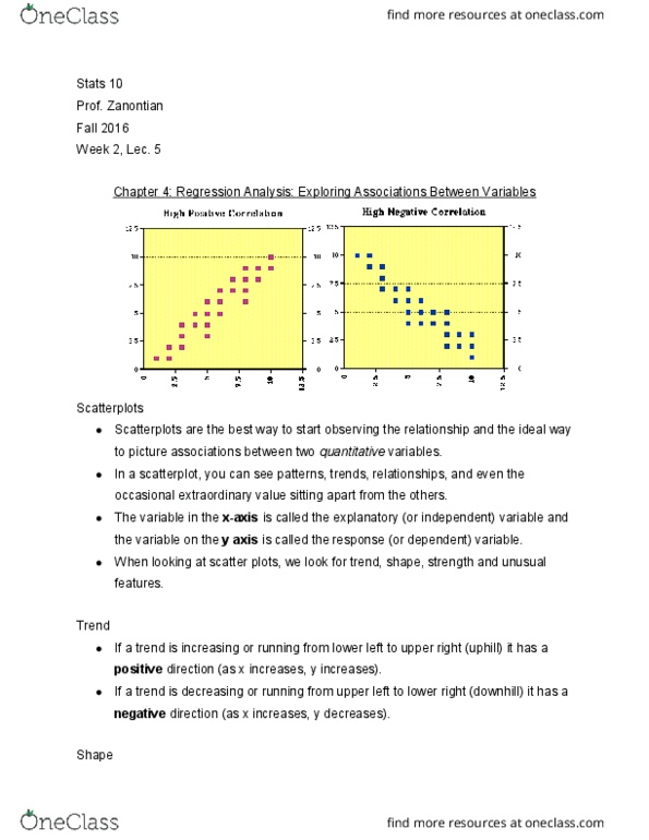
Scatterplot: used to plot relationship between two variables; each point represents one observation, and location of point
depends on values of the two variables of interest (one at x-axis, other at y-axis)
● Each observation is a PAIR of values
● horozontal/vertical axes do not have to be on same scale → just label properly
● Bottom left corner does not have to start at (0,0); we want to zoom in on the relationship between the two
variables and not have a lot of empty space
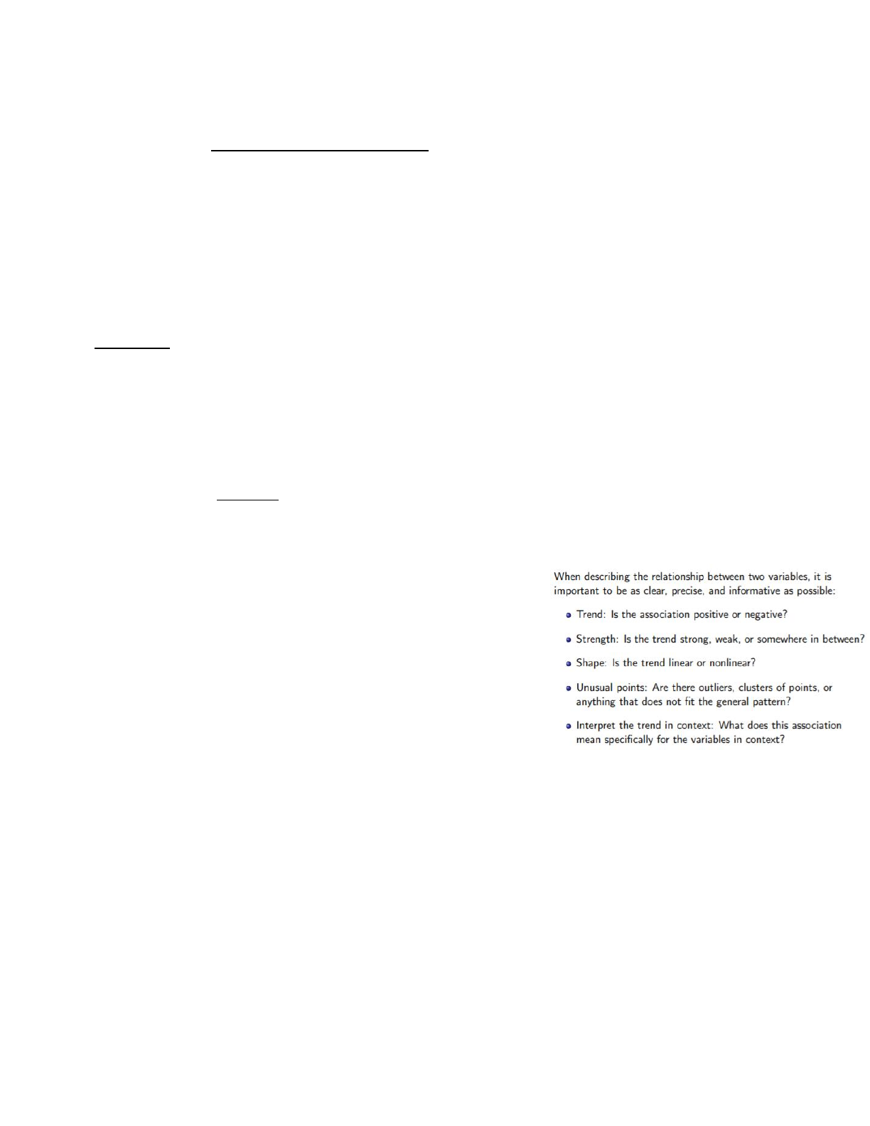
The Big Three (of analyzing relationship between TWO variables via scatterplot)
● Trend
● Strength
● Shape
Trend: association between two variables (associated if there is relationship bewteen them)
● Trend of association=general tendency of scatterplot scanning from left to right
○ Increasing trend (positive association/trend)→ uphil/rising tendency; increases in one variable are
associated w/ increases in the other variable
○ Decreasing trend (negative association/trend)→ downhill/falling tendency; increases in one variable are
associated with decreases in the other
● Describes general tendency, not all individual behavior between two variables
○ Do not use absolute terms when interpreting trends in context!!!!!
● Not always clearly positive or negative!
Strength: of an association (trend)=how closely related two variables are
(amount of scatter in the scatterplot)
● Refers to spread of points in the vertical direction
○ Weak association/trend=large amount of scatter, ie high
vertical variation; trend harder to visually detect
○ Strong association/trend=little scatter, ie low vertical
variation; trend easier to visually detect
● Strength → how well knowing one variable can predict the other
○ Relative strength (which trend=stronger?) is easier to
distinguish than labelling a trend by itself (subjective!)
Shape: rate of increase/decrease in the trend
● Linear: trend always increases/decreases at the same trait; can be
summarized w/ straight line (superimposed
● Nonlinear: rate of increase/decrease changes depending on values of variables
○ E.g. quadratic, exponential, etc; not really covered in course, more focus on linear
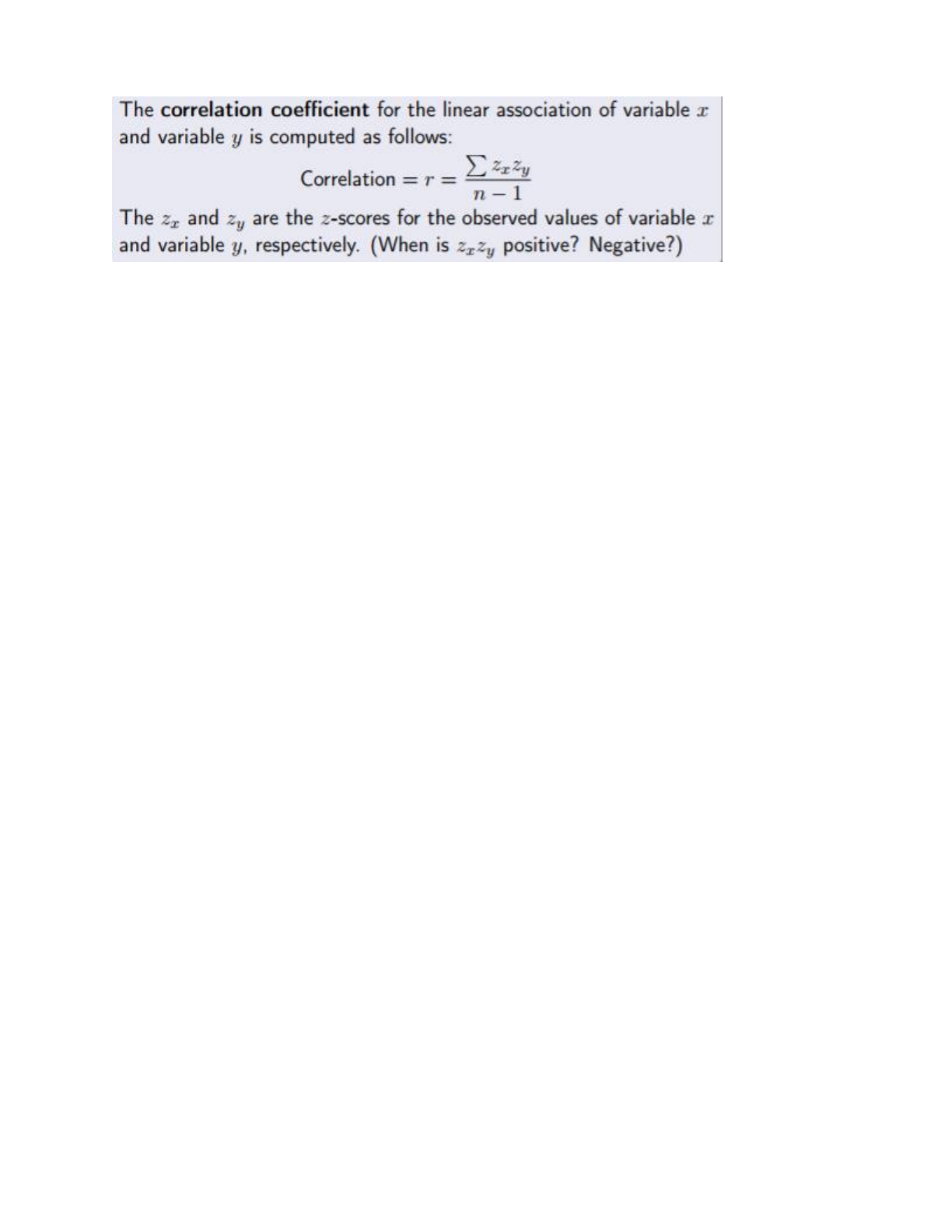
Correlation coefficient (correlation): # that measures the strength of the LINEAR association between two numerical
values
● Two variables are correlated if they are LINEARLY associated
● Only makes sense when trend is LINEAR and both variables are NUMERICAL
● Correlation coefficent denoted as r
○ Always between -1 and 1
○ Both value and sign are important
■ Value: strength
● If value is close to -1 or +1, association is strong
● If value is close to 0, association is weak (correlation=0 if scatterplot shows nonlinear)
■ Sign: direction
● If sign is +, trend is +
● If sign is -, trend is -
find more resources at oneclass.com
find more resources at oneclass.com
● CORRELATION DOES NOT IMPLY CAUSATION! (even if the correlation is close to -1 or +1)
○ Only a measure of linear association,
●
○ Find the mean and standard dev to find z score
○ Do this for each x and each y
○ For each observation (scatterplot point), multiply the x and y z-scores
○ Add all the z-score products up!
○ Divide this number by n-1 (sample size-1)
■ Points that add to correlation: values of 2 variables BOTH above or BOTH below means
■ Points that subtract from correlation: value of one variable above mean and one below mean
■ Points that do not contribute to correlation have value of at least one variable equal exactly to the
mean
● Properties of correlation
○ The order of variables does not matter
■ Height vs. hand spain is the same as hand span vs. height
● Highlights fact that correlation only tells us about strength of association, cannot imply
causality
○ Unitless
■ Only depends on z-scores, units of measurement for each variable don’t affect correlation
● inches//pounds is same correlation between cm//kg
○ Only linear
■ Correlation does not tell you whether an assocation is linear
● Does not tell you shape of graph
● If the association is linear, THEN the correlation coefficient is a measure of its strength
● If the association is nonlinear, then the correlation coefficient does not have much
interpretability
Statistical modeling
● One way to measure a trend
○ Make an assumption that the trend can be summarized by a math equation
○ Use observed data to estimate mathematical equation tha tbest describes trend
○ Analogous to a physical model, except statistical models have inherent uncetainty and must account for
variation
○ FOR LINEAR TRENDS, assume trend can be summed by a line equation: regression line
■ Regression line: statistical model that summarizes the linear trend of observed values → also
represents best guess/prediction for any new or future observations
● Equation for (straight) line: y=mx+b
○ m=slope (how steep the line is); change in y for a unit increase in x
○ b=y-intercept (value of y when x=0)
● Statisticians typically write equation of line w/ intercept first: y=a+bx
○ a=y-intercept
○ b=slope
● Also called least squares line as it’s chosen as to minimize the sum of squared (vertical)
distances of the observed and predicted values → BEST FIT line
find more resources at oneclass.com
find more resources at oneclass.com
Document Summary
Chapter 4: regression analysis: exploring associations between variables. Plots to visualize numerical data: dotplots, histograms, stemplots. When describing numerical distribution, consider: shape, center, spread. We will consider questions about the relationship between two numerical variables. Scatterplot: used to plot relationship between two variables; each point represents one observation, and location of point depends on values of the two variables of interest (one at x-axis, other at y-axis) Each observation is a pair of values. Horozontal/vertical axes do not have to be on same scale just label properly. Bottom left corner does not have to start at (0,0); we want to zoom in on the relationship between the two variables and not have a lot of empty space. The big three (of analyzing relationship between two variables via scatterplot) Trend: association between two variables (associated if there is relationship bewteen them) Trend of association=general tendency of scatterplot scanning from left to right.