POSC300 Lecture Notes - Lecture 14: Pie Chart, Bar Chart, Doubleclick

2 Dec 2018
School
Department
Course
Professor
Document Summary
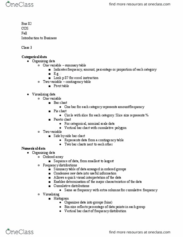
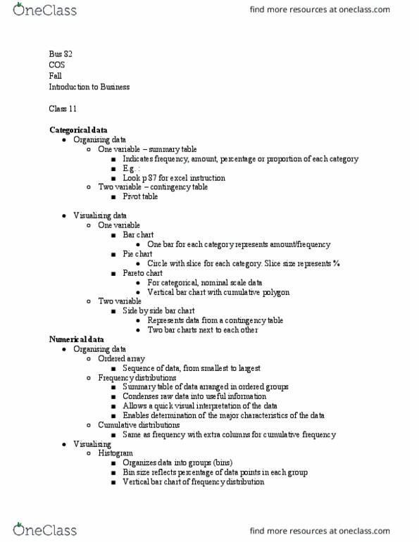
X axis (right and left) is your variable. Y axis (up and down) is your total n (# cases) Height of each bar represents frequency or percentage of the total n. Each slice is a category for your variable and its size indicates the percentage of that category compared to the total n. Useful for giving a snapshot of the distribution of important nominal/ordinal variables in your work. Butmore often than not a table is better i. e. better to have a table with the different categories of your variable and then list the frequency and percentage for each. Under choose from select the category of graph you want. Select the style of graph from the pictures and drag it towards the blue text above. Make sure your variable has labels before you start. Drag your variable into the x axis. Set statistics to count on the right side.