STA220H5 Chapter Notes - Chapter 2: Pie Chart, Bar Chart


STA220
Chapter 2.1
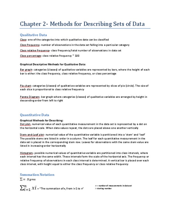
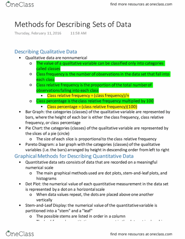
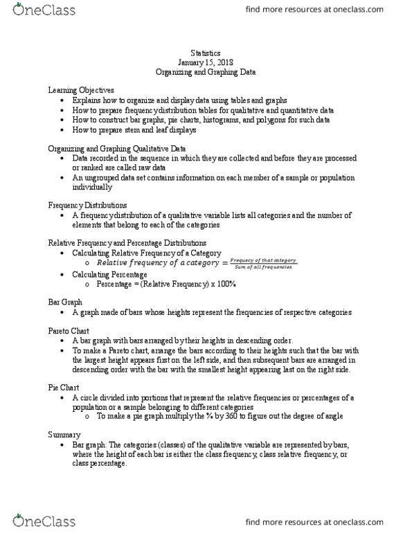
A class is one of the categories into which qualitative data can be classified.
The class frequency is the number of observations in the data set that fall into a
particular class.
The class relative frequency is the class frequency divided by the total number of
observations in the data set; that is,
Class relative frequency = class frequency/n
The class percentage is the class relative frequency multiplied by 100; that is,
Class percentage = (class relative frequency) x 100
Summary of graphical descriptive methods for qualitative data
Bar graph: the categories (classes) of the qualitative variable are represented by
bars, where the height of each bar is either the class frequency, class relative
frequency, or class percentage.
Pie chart: the categories (classes) of the qualitative variable are represented by
slices of a pie (circle). The size of each slice is proportional to the class relative
frequency.
Pareto diagram: a bar graph with the categories (classes) of the qualitative variable
(i.e., the bars) arranged by height in descending order from left to right.
2.2
Determining the number of classes in a histogram
Number of observations in data set
Number of classes
Fewer than 25
25-50
More than 50
5-6
7-14
15-20
Summary of graphical descriptive methods for quantitative data
Dot plot: the numerical value of each quantitative measurement in the data set is
represented by a dot on a horizontal scale. When data values repeat, the dots are
placed above one another vertically.
Stem-and-leaf display: the numerical value of the quantitative variable is
partitioned into a stem and a leaf. The possible stems are listed in order in a
column. The leaf for each qualitative measurement in the data set is placed in the
corresponding stem row. Leaves for observations with the same stem value are
listed in increasing order horizontally.
Histogram: the possible numerical values of the quantitative variable are
partitioned into class intervals, each of which has the same width. These intervals
find more resources at oneclass.com
find more resources at oneclass.com
Document Summary
A class is one of the categories into which qualitative data can be classified. The class frequency is the number of observations in the data set that fall into a particular class. The class relative frequency is the class frequency divided by the total number of observations in the data set; that is, The class percentage is the class relative frequency multiplied by 100; that is, Class percentage = (class relative frequency) x 100. Summary of graphical descriptive methods for qualitative data. Bar graph: the categories (classes) of the qualitative variable are represented by bars, where the height of each bar is either the class frequency, class relative frequency, or class percentage. Pie chart: the categories (classes) of the qualitative variable are represented by slices of a pie (circle). The size of each slice is proportional to the class relative frequency.