BMGT 230 Chapter Notes - Chapter 2: Pie Chart, Bar Chart, Contingency Table

6 Feb 2017
School
Department
Course
Professor
Document Summary
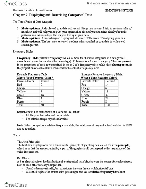
Bmgt230 textbook notes chapter 2 displaying and describing categorical data. Frequency table - records the counts for each of the categories of the variable. Make a picture a well designed display will do much of the work of analyzing your data. It can show the important features and patterns. A picture will also reveal things you did not expect to see: extraordinary (or possibly wrong) data values or unexpected patterns. Make a picture the best way to report to others what you find in your data is with a well-chosen picture. Do(cid:374)"t (cid:448)iolate the area pri(cid:374)(cid:272)iple this is probably the most common mistake in a graphical display. Bar chart displays the distribution of a categorical value, showing the counts for each category next to each other for easy comparison. Relative frequency bar used when we want to draw attention to the relative proportion of visits from each source.