MATH 1F92 Lecture Notes - Lecture 7: Scatter Plot, Standard Deviation

19 Oct 2017
School
Department
Course
Professor
Document Summary
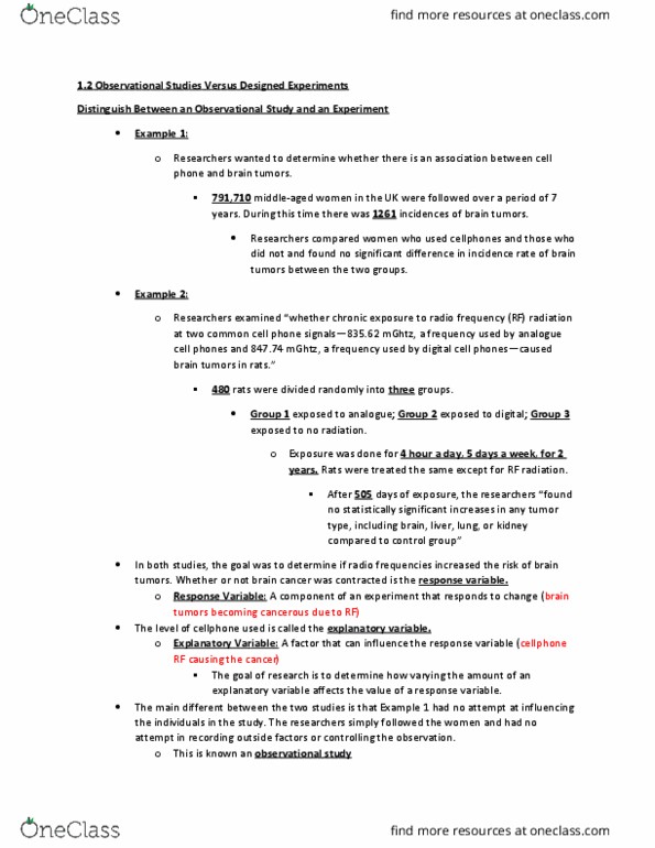
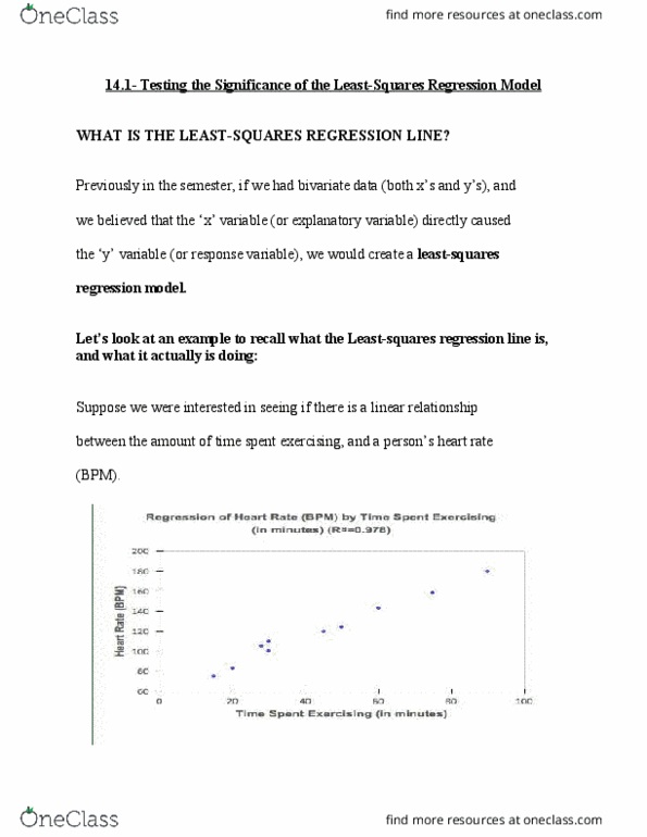
We are going to look at bivariate data now (two variables): start looking at how one variable affects another. I(cid:374) parti(cid:272)ular it"s the relatio(cid:374)ship (cid:271)etwee(cid:374) (cid:454) a(cid:374)d (cid:455). A(cid:374) e(cid:454)a(cid:373)ple of this (cid:272)ould (cid:271)e (cid:455)ears of education and starting salary. Explanatory variable (x): an independent variable that is said to explain the response variable. Response variable (y): dependent variable that is said to be caused by the explanatory variable. Try to see the type of relationship between variables using scatter diagrams. Example of axis: y = years of education, x = starting salary: as years of education increase, the higher the starting salary is. Therefore increasing: the scatter diagram is able to tell us what type of association the variables share, positive, negative, no relation. Positive association: as the explanatory variable increases, the response variable increases. Negative association: as the explanatory variable increase, the response variable decreases.