PSYC 2600 Lecture Notes - Lecture 4: Descriptive Statistics, Pareto Chart, Scatter Plot

23 Jan 2019
School
Department
Course
Professor
Document Summary
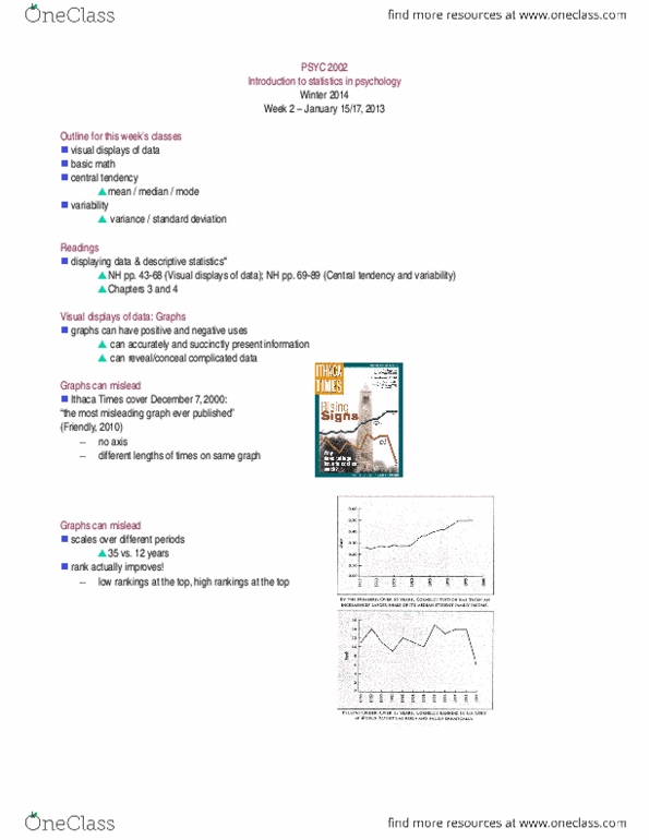
Graphs can have positive and negative uses. When the independent variable is nominal and the dependent variable is interval. Pareto chart : bar graph in which categories along the x-axis are ordered. Bar graphs can be used to highlight differences between means (averages) from highest to lowest. Scatterplot : graph that depicts the relation between two scale variables. One interval variable: histogram or frequency polygon. One interval independent & dependent variable: scatterplot or line graph. One nominal independent & one interval dependent variable: bar graph. >2 nominal independent & one interval dependent variable: bar graph. N or n : number of scores, observations. M = (x1 + x2 + x3 + xn) / n. Statistical formulas follow standard rules for the ordering of mathematical operations: operations in parentheses, squaring, multiply/divide, add/subtract. All the digits to the right of decimal are necessary for perfect accuracy. However, in practice, only the first three digits past the decimal are typically used in publications.