STAT-2126EL Lecture Notes - Lecture 4: Bar Chart, Frequency Distribution, Level Of Measurement

14 Dec 2018
School
Department
Course
Professor
Document Summary
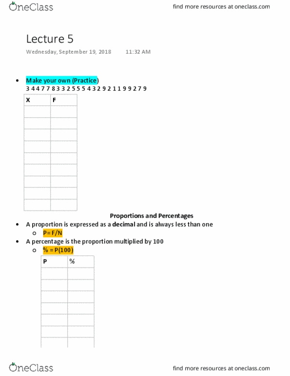
A proportion is expressed as a decimal and is always less than 1. Percentage simply the proportion multiplied by 100, most likely invented because 50% is easier to say than a proportion of 0. 5. Sometimes the range of scores is too wide to be placed in simple frequency table, the solution is to make groupings of values that include all values within a certain interval. Rules: pick a table that has roughly 5-10 groupings, might need intervals for this, 2, 5 and 10 are typical for intervals, do not change the grouping interval in middle of table. Which interval would you put 49. 3 in: 40-49 as you can round down. Round up or down and put it in category. Where would you put 29. 5: round up. Histogram: data has been measured with an interval or ratio scale: height is frequency of score (y-axis, width is the interval of the category (x-axis)