ACC 406 Lecture Notes - Lecture 2: Bar Chart, Time Warner, Histogram

Document Summary
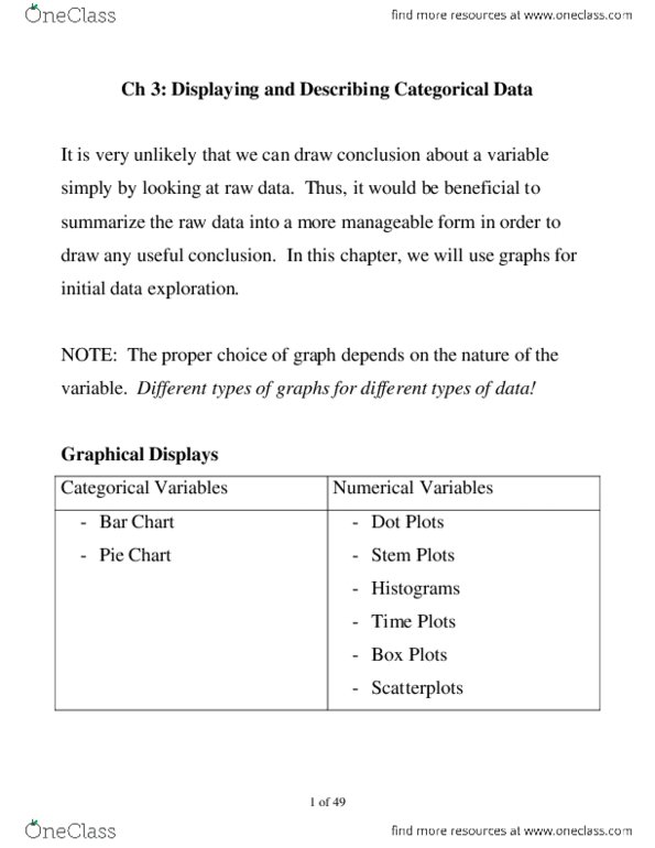
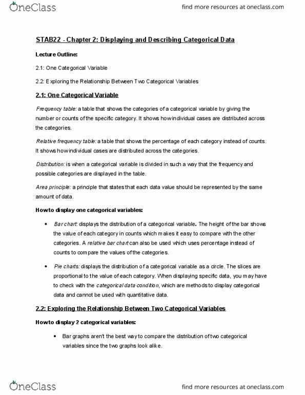
Chapter 2 exercises: the following table shows new car sales for the top six automobile companies in the. If we want to compare the sales figures of the car companies, indicate which chart you would favor as the most effective way of presenting the data. Answer: bar chart, we want to compare the individual sales figures with each other but not with the total: a university has the following number of students at each grade level. If the university wants to compare the number of students in each category with the total number of students, indicate which chart you would favor as the most effective way of presenting the data. Discuss whether a pie chart or a bar chart would be most appropriate to present these data graphically. Answer: bar chart, we want to compare the individual sales figures with each other.