SSCI 2910U Lecture Notes - Lecture 4: Scatter Plot, Descriptive Statistics, Standard Deviation

Document Summary
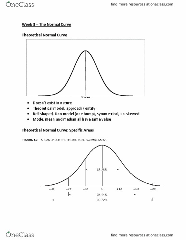
Slide 1: when constructing a histogram, you use the real limits (class boundaries) When constructing a bar graph, you use the stated limits (upper limit or upper boundary) In a normal curve, the mode, median and mean have the same value. Slide 4: if we take the 68% of scores, those particular scores should fall between -1 and +1 standard deviation. Using this slide, answer question #6 on assignment 1. Slide 5: for histogram, choose variable, go to analyze descriptive statistics frequencies choose variable, and select charts on the right select histograms and show normal curve on histograms continue and ok. On excel: for average/mean type =average(a2:a40) and click enter. For standard deviation type =stdev. s(a2:a:40) and click enter. To get the normal distribution values, type =norm. dist(a2,,,false) and drag down till cell 40. Highlight data, go to insert charts scatter/plot area. Slide 8: normal curve does more than reporting the mean (average)