STA215H5 Lecture Notes - Lecture 3: Pie Chart, Categorical Variable, Box Plot

30 Sep 2018
School
Department
Course
Professor
Document Summary
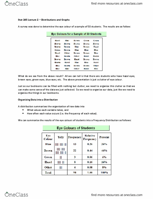
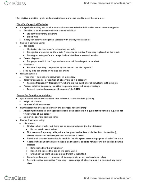
Lec101 notes: unit 3 graphical data summaries. Unit 3: objectives: understand what graphs most appropriately represent categorical or numerical data, create graphs manually given a set of data, describe shape properties of boxplots and histograms, compare these properties. Pie chart: for categorical data: relay frequencies or relative frequencies (percentages), create a frequency table for pie chart. Example: using a pie chart for student body president election results. Bar graph: for categorical data: bars should not touch (bars touching implies continuity, heights are counts, rectangles should have equal widths. Example: create a bar graph for eye colour with the following data: {br, br, br, bl, br, br, g, bl, br, br, g, br, br} Histogram: used for numeric values: horizontal axis: no empty space between rectangles, labelled using class boundaries, vertical axis: often the frequency, may* be relative frequency. Frequency tables: applies to numeric data: data is split into classes (equal width)