Psychology 2800E Lecture Notes - Lecture 8: Cartesian Coordinate System, Line Graph, Interpolation

19 Oct 2018
School
Department
Course
Professor
Document Summary
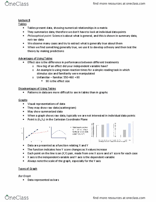
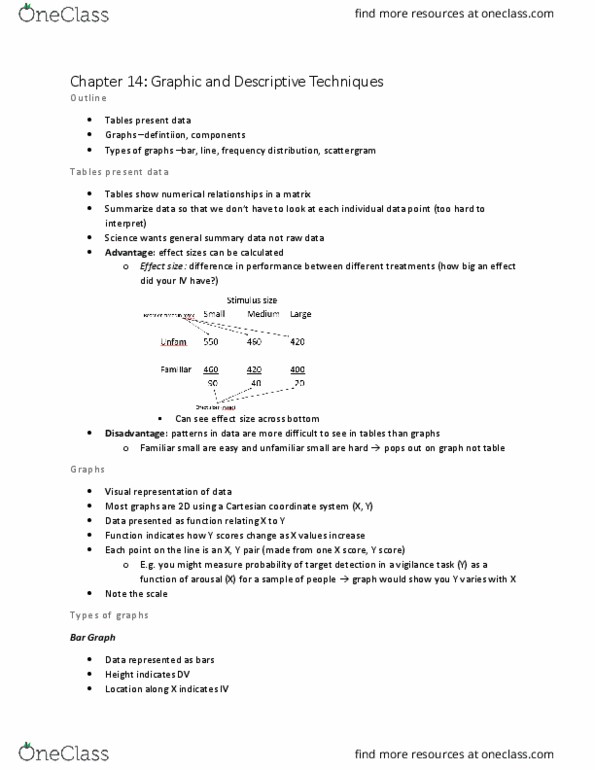
Disadvantages patters in data are more di cult to see in tables than graphs. Y axis = dependent variable important to note the scale whenever you look at a graph. Bar graphs: data is represented as bars use when data are categorical we can objectively measure how deceptive a bar graph is by using the gdi (an operationalization for bar graphs) Gdi = [(a/b) - 1] x 100 a = percentage change in cm shown in graph (height of highest column - height of smallest column) = percentage change shown in the data (+) gdi = the graph exaggerates the trend (-) gdi = the graph understates the trend. Line graphs: show dependent variable as a fxn of independent variable points show actual data lines connecting points show interpolations use when response varies continuously with i. v. Interpolation: inferring the y values at an x value between two know x points. Frequency distributions: show frequency with which di observations happen.