STAT-2300 Lecture Notes - Lecture 4: Histogram

1 Mar 2017
School
Department
Course
Professor
Document Summary
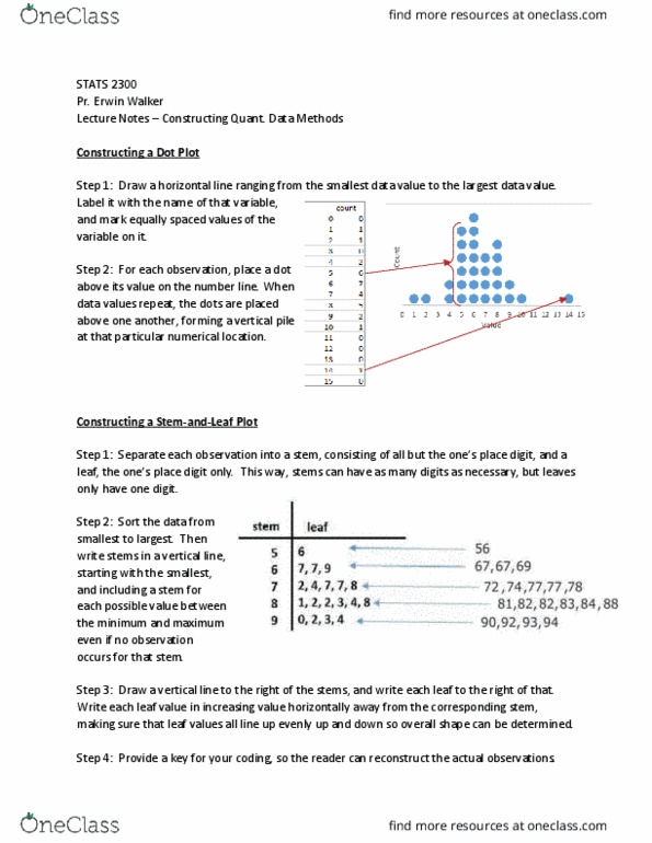
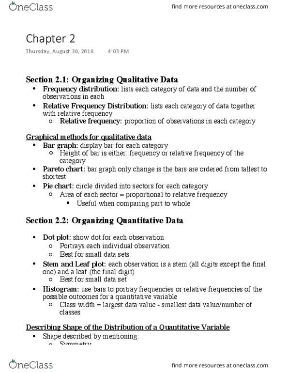
Quantitative data is known as data that takes on numerical values and represents different magnitudes for that variable. There are different ways to organize this data than if we were to have qualitative data because we can utilize the number system to show magnitude of variables. Dot plot = shows a dot for each individual observation, places just above the value on the number line for that observation. Stem-and-leaf plot = each individual observation is represented by a stem (consisti(cid:374)g of all digits e(cid:454)(cid:272)ept the o(cid:374)e"s pla(cid:272)e (cid:448)alue for ea(cid:272)h o(cid:271)ser(cid:448)atio(cid:374)(cid:895) a(cid:374)d a leaf (cid:894)o(cid:374)e"s pla(cid:272)e (cid:448)alue for ea(cid:272)h o(cid:271)ser(cid:448)atio(cid:374)(cid:895). Histogram = a graph that uses bars to portray the frequency of the possible out(cid:272)o(cid:373)es. It does(cid:374)"t sho(cid:449) i(cid:374)di(cid:448)idual o(cid:271)ser(cid:448)atio(cid:374)s, and looks similar to a bar graph but has numbers on the bottom rather than categories. All research done has different conditions, and different methods are better for different types of data sets.