STAT 1430 Lecture Notes - Lecture 3: Bar Chart

15 Jan 2019
School
Department
Course
Professor

STAT 1430 verified notes
3/30View all
Document Summary
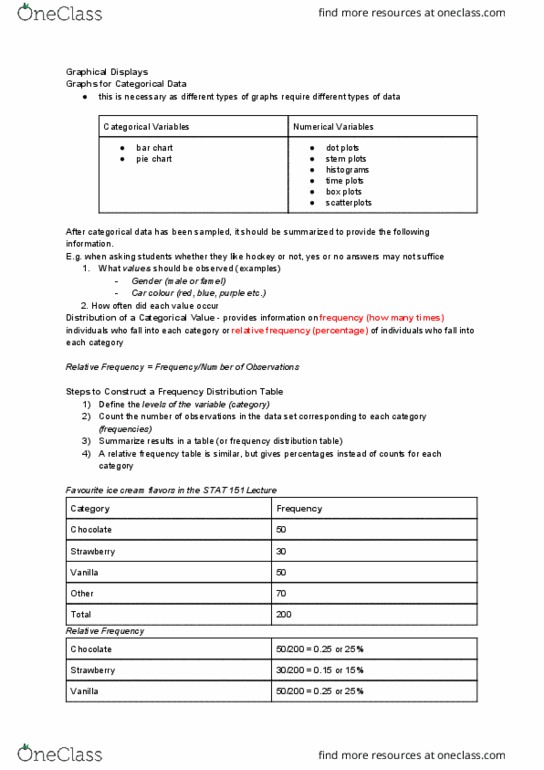
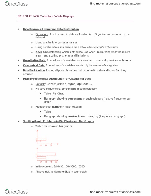
Bar graph showing percentage in each category (relative frequency bar graph: frequencies: number in each category. Bar graph showing number in each category (frequency bar graph: spotting/avoid problems in pie charts and bar graphs, watch the scale on bar graphs. In this context: 3/10 30/100 3000/10000: always include sample size in your graph, displaying the distribution for quantitative data, we us graphs to show 3 important characteristics in a data set: shape, center and variability, one way: histogram. Divide the entire range of values in to a series of intervals and then count how many values fall into each interval. Vertical axis: number or percentage in each group: e. g. Unemployment rate in 2011: data: unemployment rates for all 50 states plus puerto rico (7/2011, 5. 8, 7. 6, 8. 5, 9. 3, 6. 1, 5. 7, 7. 5, 8. 4, 9. 8, 4. 7, 10. 9, 10. 8, 7. 8, 9. 5, 5. 5, 9. 0, 3. 3,