ECO100Y1 Lecture Notes - Opportunity Cost

Get access


Related textbook solutions


Related Documents
Related Questions

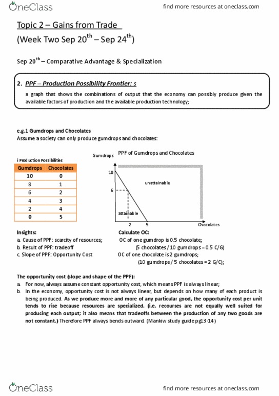
Table 1 Output per labor hour
|
Country |
Tons of Steel |
TVs |
|
United States |
15 |
45 |
|
United Kingdom |
10 |
20 |
Referring to Table 1, the United States has the absolute advantage in the production of:
A) Steel
B) TVs
C) Both steel and TVs
D) Neither steel nor TVs
11.
Referring to Table 1, the opportunity cost of one ton of steel in terms of TVs
A) is 45 TVs for the United States and 15 TVs for the United Kingdom.
B) is 15 TVs for the United States and 20TVs for the United Kingdom.
C) is 15/45 = 1/3 of a TV for the United States and 15/20 = 3/4 of a TV for the United Kingdom.
D) is 45/15 = 3 TVs for the United States and 20/10 = 2 TVs for the United Kingdom.
12.
Referring to Table 1, the opportunity cost of one TV in terms of steel
A) is 15 tons of steel for the United States and 10 tons of steel for the United Kingdom.
B) is 10 tons of steel for the United States and 20 tons of steel for the United Kingdom.
C) is 15/45 = 1/3 of a ton of steel for the United States and 10/20 = 1/2 of a ton of steel for the United Kingdom.
D) is 45/15 = 3 tons of steel for the United States and 20/15 tons of steel for the United Kingdom.
13.
Referring to Table 1, the United Kingdom has a comparative advantage in the production of:
A) Steel
B) Televisions
C) Both steel and televisions
D) Neither steel nor televisions
14.
Referring to Table 1, based on the principle of comparative advantage the United States should export
A) steel
B) TVs
C) both steel and TVs
D) neither steel nor TVs

- The production possibilities table below illustrates the real economic sacrifices (costs) which the choice of different production combinations entails
| Combinations | Pounds of Bread | Tons of Coal | |
| a | 12,000 | 0 | |
| b | 11,000 | 1 | |
| c | 9,000 | 2 | |
| d | 5,000 | 3 | |
| e | 0 | 4 |
- Use a grid at least 4" by 4" to graph the production possibilities shown by the table in question 1. Now, on the same diagram, plot the following production possibilities data:
| Combinations | Pounds of Bread | Tons of Coal | |
| a | 12,000 | 0 | |
| b | 11,500 | 1 | |
| c | 10,000 | 2 | |
| d | 7,500 | 3 | |
| e | 4,000 | 4 | |
| f | 0 | 5 |
Explain what could have caused the production possibilities to curve to move in the manner shown by the difference between curve 1 and curve 2 in the diagram you prepared in question. You do not have to send the diagram, just the explanation describing what happened and the probable cause.
