PUB 131 Lecture Notes - Lecture 5: Dash, Cap Height, Monospaced Font

19 Oct 2018
School
Department
Course
Professor
Document Summary
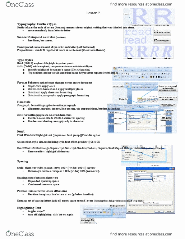
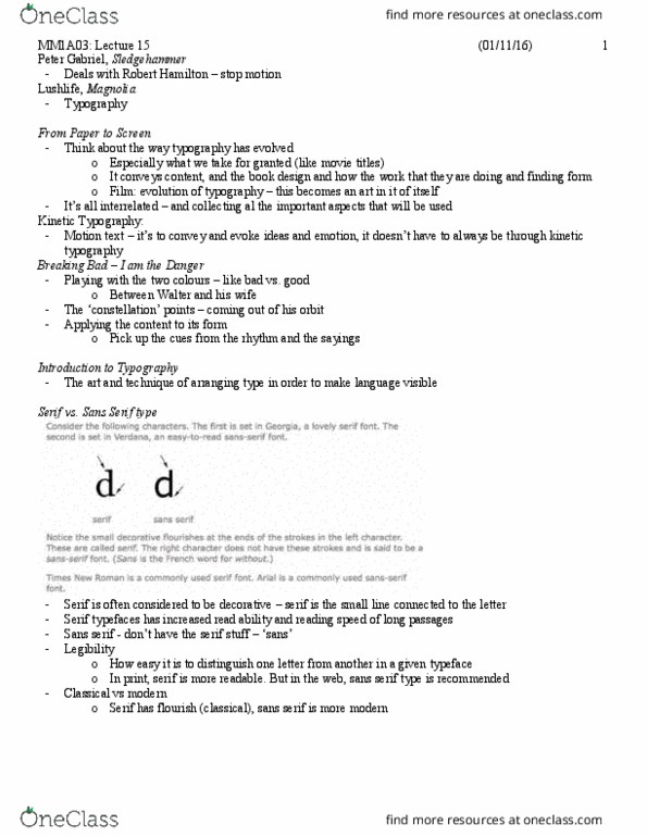
Micro typography typographic styling for detail & hierarchy. Typographic detail: drop caps (multiple line letter) & decorative initials, paragraph spacing methods. Lining figures: all same height (like capitals: tabular figures. Hyphen: used to separate words across lines of text & to hyphenate: en dash: width of lowe(cid:396)(cid:272)ase (cid:862)(cid:374)(cid:863); used fo(cid:396) (cid:396)a(cid:374)ges of thi(cid:374)gs to (cid:396)epla(cid:272)e (cid:862)to(cid:863), e. g. -- em dash: width of lowe(cid:396)(cid:272)ase (cid:862)(cid:373)(cid:863); used fo(cid:396) e(cid:373)phasis a(cid:374)d to sepa(cid:396)ate: e. g. Em dashes are used for---emphasis---and to---separate: quotes, apostrophes & commas, (cid:862)dou(cid:271)le (cid:395)uote(cid:863); (cid:858) i(cid:374)gle (cid:395)uote(cid:859) 66 & 99, apost(cid:396)ophe(cid:859)s straight line, comma, 9, dou(cid:271)le p(cid:396)i(cid:373)e (cid:1005)(cid:1004)(cid:863) (cid:894)i(cid:374)(cid:272)hes(cid:895); p(cid:396)i(cid:373)e 3(cid:859) (cid:894)feet(cid:895) slight straight lines. Interrobang: : octothorpe # (aka. hash/pound): the writing movement of lb, the at symbol @: the writing movement of at, choosing fonts that work well together, considerations: Is the character width approximately the same: e. g. Sans + serif; georgia + verdana; not zapfino + courier. Typographic hierarchy: styling text to differentiate: colour, sizing, positioning, boldness .