PUB 131 Chapter Notes - Chapter 4-1: Sans-Serif, Slab Serif, Claude Garamond

12 Oct 2016
School
Department
Course
Professor
Document Summary
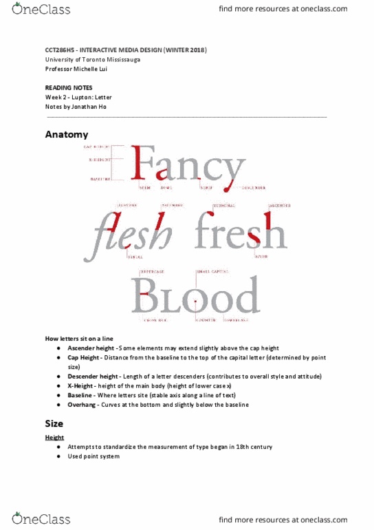
The distance from the baseline to the top of capital letter. The cap height of a typeface determines its point size. The height of the main body of the lowercase letter, excluding its ascenders and descenders. This is the most stable axis along a line of text, and it is a crucial edge for aligning text with images or with other text. Some elements may extend slightly above the cap height. The curves at the bottom of letters hang slightly below the baseline. Commas and semicolons also cross the baseline. If a typeface were not positioned this way, it would appear to letter precariously, lacking a sense of physical grounding. The x-height usually occupies slightly more than half of the cap height, the bigger the x-height is in relation to the cap height, the bigger the letters will look. The greatest density occurs between the baseline and the top of the x-height.