RTA 103 Lecture Notes - Lecture 3: Pat Metheny, Talking Heads, Letraset

7 Dec 2017
School
Department
Course
Professor
Document Summary
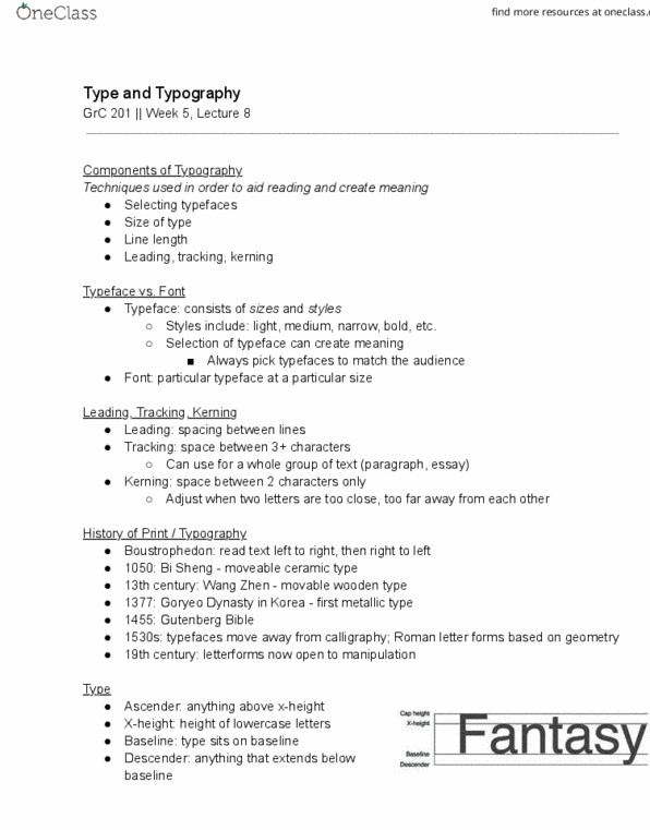
Always be mindful of history in design. Be aware of what typefaces you"re using, keep it simple. A priest or religious leader, especially christian or muslim. After printing tons of copies of the bible, he decided to print works that no one has ever read before. The printer decided what should be printed on the printing press in the first place. We don"t read words, but see shapes and symbols first. As soon as we learn to recognize we work to derive meaning from them. Tells us what the mood or tone is by its design. Type is a subtle form of persuasion. Each letterform has its own body, shape and form. Always has feet at the end of a letter (more sophisticated) Whereas sans (french for without) serif is without the feet at the bottom of the letter. Serif is easier for the eye, especially for large bodies of text. Sometimes we use font and typeface interchangeably.