COM 2033 Lecture Notes - Lecture 3: Sans-Serif, Serif, Times New Roman

Document Summary
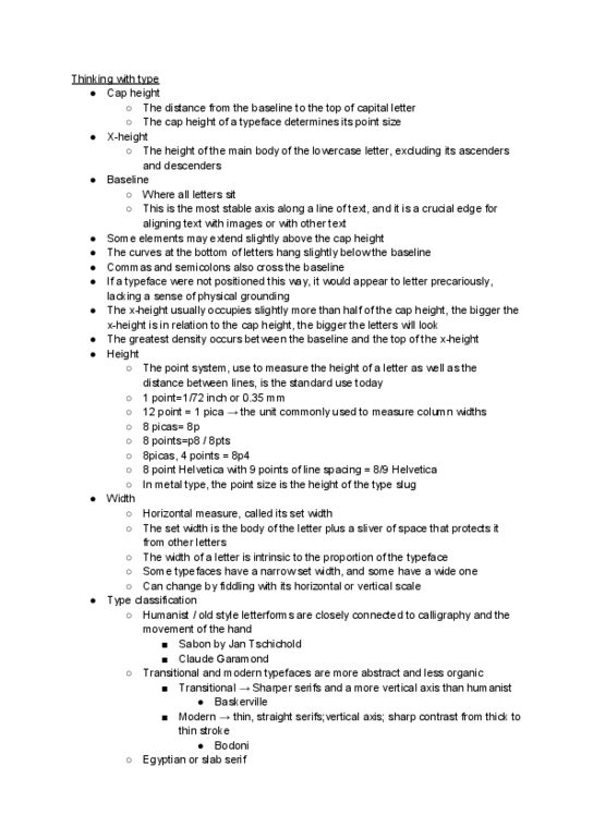
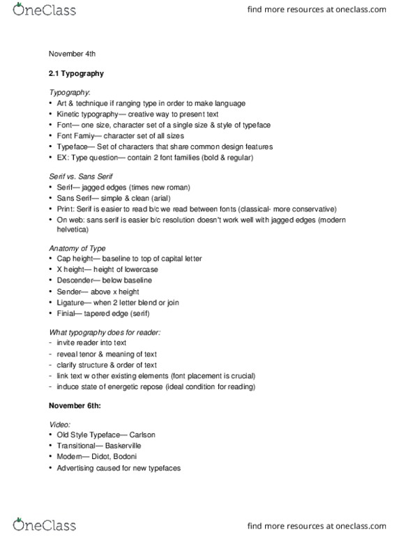
Typography is the art of selecting and arranging type or using type in various graphic designs to obtain particular effects. Different typefaces have different looks and different meanings for people. We measure type in points and picas: 12 points to a pica and 6 picas to an inch. For example, this lecture is in 14 point font (1 pica and 2 points). Design of the letter includes: basic shape (proportion of the parts), stance (weight or blackness), dimensions (contrast among parts), letter of size (contour or outline), width of letter (alignment along reading line), quality of line (kind of strokes) Display typefaces: text typefaces are geared more toward legibility (like reading this lecture). Display typefaces are more to generate an attitude to catch our attention (like cool concert posters from the 60s -- google it). Serif vs. sans serif typefaces: serif - a short cross-line found at the end of the letters (like times new roman).