BIOL 3P96 Lecture Notes - Lecture 2: Bar Chart, Skewness, Frequency Distribution

27 Jun 2015
School
Department
Course
Professor

Document Summary
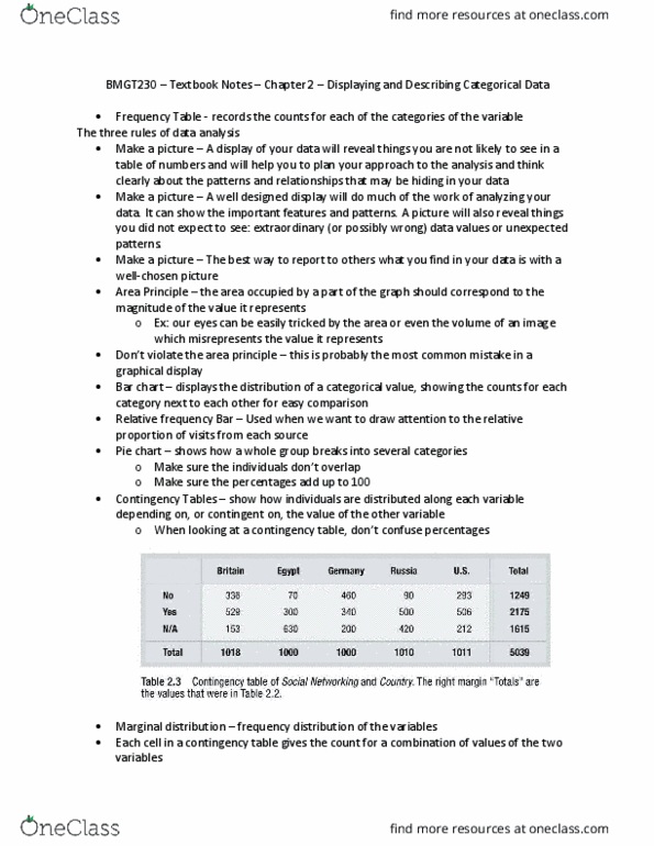
Florence nightingale: used wedge diagrams to visualize causes of death of british troops, number of cases indicated by the area of the wedge, cause of death by the colour. How to draw a good graph: show the data, make the patterns in the data easy to see, represent magnitudes honestly, draw graphical elements clearly. Show the data: displaying data points allows for evaluation of data distribution and overall trends, allows identification of extreme observations. Represent magnitudes honestly: a bar graph must always have a baseline of zero so that area of each bar is proportional to the magnitude displayed, bars should be equal width. Showing categorical data: a frequency table is a text display of the number of occurrences of each category in the data set. Drawing a good histogram: baseline of zero, bars are contiguous (no spaces, value exactly at boundary should be placed in higher bin, no strict rule on number of intervals used natural logarithm.